Last month Apple released a preview of their new operating system, OS X Yosemite. Following the visual refresh in iOS 7, Yosemite features a significant visual change. Apple has added the familiar blur and translucent materials, a cleaner looking user interface, a new system font and updated icons.
I want to focus on my favorite visual update in Yosemite — the dock icons. Before Yosemite, Apple maintained a system for icon design through a checklist of mostly unstated and understood guidelines paired with a few specific recommendations in the Human Interface Guidelines (HIG). With Yosemite, that system becomes more consistent, and regular, yet the HIG remains silent on the specifics.
The first thing people usually want to discuss with an update like this is the look and feel. However, there are plenty of comparisons between the Mavericks and Yosemite icons. They’re cleaner, they’ve removed the gloss, made things happier and brighter looking, and retained some skeuomorphic elements.
The Finder and Settings icons are beautiful; Safari’s icon looks better on the Mac than it does on iOS; the Calculator icon is terrible; Game center is awkward; and FaceTime looks like a mistake.
Great. Let’s move on.
There is a lot more to the new icons than just a fresh coat of paint — the visual language extends far beyond just the gradients.
When 10.10 ships this fall, your users will expect your icons to feel at home in the new system. Rather than critique the icons, I’m going to dissect the icon system and focus on the small details that will help you make icons that look great in Yosemite.
Over the past few weeks I’ve spent a lot of time trying to understand the new system and taking note of the visual language. This is what I’ve uncovered.
The Dock
It’s hard to talk about the dock icons without first mentioning the dock. The 2D dock is back, so let’s take a moment to rejoice.
The shapes and sizes of the icons have been adjusted to provide a better visual rhythm on screen. I have not seen it published anywhere, but there appears to be a grid system that helps achieve this consistency. I’ll get back to that, but first let’s talk about the shapes.
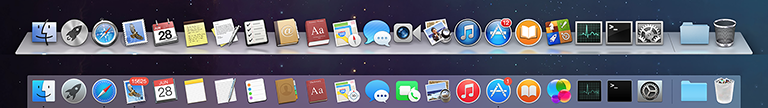
As you scan across the dock on Mavericks (and before), your eye stumbles across the mismatched sizes, shapes, and aesthetic styles added as the OS changed and new apps were added to the system. It becomes really obvious how eclectic the style had become when you compare the default dock in Mavericks (top) with the more uniform dock in Yosemite (bottom).
Icon Shapes & The Grid
The new shape and grid in iOS 7 was heavily marketed by Apple and publicized in blogs, but there has been little on the new shapes in Yosemite. Andreas Wendker merely glossed over it in the State of the Union.
Apple’s designers re-wrote the icon system for Yosemite. Or better stated: they introduced the beginnings of a system. (Note: this is all based on the Beta and first “public” iteration of the new icons. I expect this system to become more clear as we approach the launch of Yosemite).
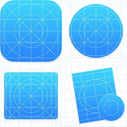
There are three basic shapes utilized for application icons across the system. A circle, a square, and a tilted rectangle. Of course, Apple is consistently inconsistent and deviates from this system in a few places, but they are clearly outliers.

To better understand these shapes, I started with the iOS 7 grid, and overlaid it on each of the 1024x1024 icons from Yosemite to see how they line up. I didn’t shift the shapes at all, this is exactly where they fit.
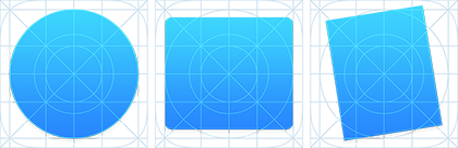
No surprise, things align pretty close for the Circle and Square. Now let’s look at this grid with the icon art. I’ve reduced the opacity of the icons so you can see the grid.
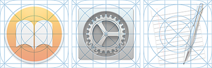
The book glyph in the iBooks icon aligns with the grid. The center gear for System Preferences is almost perfectly aligned with the grid. It might be a stretch, but the pen on TextEdit almost tucks in between the inner two circles.
You’ll also notice that the System Preferences icon is slightly smaller than the width of the grid here. Apple uses two sizes for the “square”. System Preferences and Finder share the same width, whereas Terminal and Activity Monitor are wider.
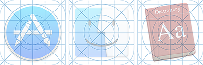
With the App Store, the “A” breaks out of the grid slightly because the “A” is more open than the solid shape of the book. The icon is thinner and has a different visual weight than the iBooks icon. Put simply, it just looks right. Aside from width, Finder sits happier in the grid.
The tilted rectangle deserves special attention since it will be the most common type of icon for third party apps.
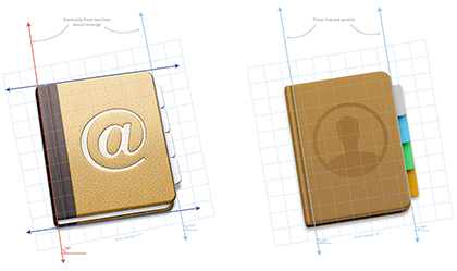
The old tilted rectangle icons, like the one on the left, are fully placed in 3D space, with natural perspective. They have a vanishing point on all axis. Put another way, if you drew a rectangle, and rotated it -11°, you would still have to skew it in perspective to match the shape.
The Yosemite icons appear orthographic at first, but with depth. They are a straight-on view of an object, with no perspective on the axis facing “the camera”. If you take a rectangle and rotate it -9°, you don’t have to skew anything, other than false 3D depth. (e.g., add the pages of the book, a drop shadow, an edge, etc.) They are much simpler in look, and easier for artists to draw. It’s difficult to describe, but the above image helps illustrate the difference.
It is clear there is an underlying structure to the icon system — at least for the circle and square. This is why things sit so nicely, and feel grounded in the dock. You don’t need a 3D shelf for that.
The grid is a guide — your eye is the best judge. If it looks right, it probably is.
There was a lot of speculation that icons in Yosemite would all be super-ellipses or circles. Thankfully that’s not the case. I think Apple designers have done a great job building a flexible system that allows for a clean look, but retain the flexibility we desire to create a unique icon.
Using the Yosemite icons as a guide, I adapted the iOS icon grid to form an updated grid for Yosemite:
Use the grid or don’t — just be aware it exists.
The Shape Hierarchy
When a new visual style is introduced it’s easy to get carried away and experiment with the options.
Stop for a second and ask yourself what your application does. One shape may represent the category better than another.
I don’t think of this as a rule, there are flaws in the logic here — In some places Apple relies on legacy shapes with icons, but I will attempt to compartmentalize them in the system.
The Circle
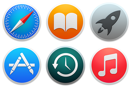
The circle appears to be used for apps — light weight pieces of software; entertainment, or consumer focused products.
They are nice looking, but I don’t think an application targeted at professionals should be a circle — but maybe your next to-do list app should be.
Shouldn’t Game Center, and Contacts also be circles? Probably, but I’m trying to avoid critique until Yosemite is released.
The Square
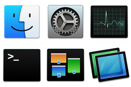
The square seems to be used for System-related utilities.
Finder, Terminal, System Preferences, Activity Monitor, and Mission Control all fit the bill. Screen Sharing also fits, but it is tilted -9°, likely because it looks better. It does receive the same styling as the square icons though. But there’s one more shape before I get into my discussion on styling.
The Tilted Rectangle
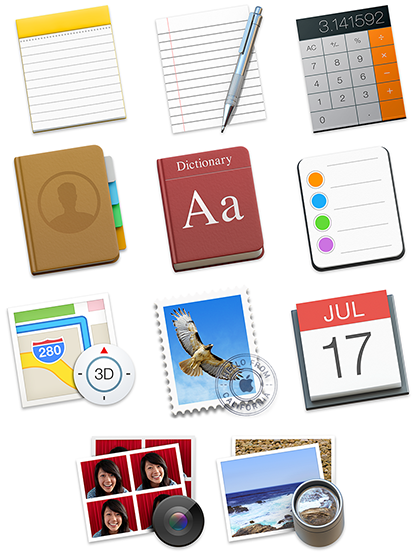
A hallmark of Apple’s icon design language since the introduction of OS X has been the perspective tilt — often with an overlaid tool. It’s still present in Yosemite, but with a new — or rather, lack of — perspective.
The tilted rectangle will be the most used shape out of these three. It’s used for Applications — tools to help you get work done. These have the most flexibility and are often paired with a 3D-like object to better represent the application’s purpose and give it a unique shape.
Lighting Effects and Materials
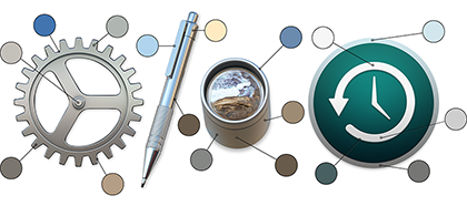
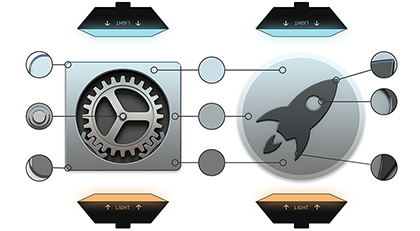
Grey scale is out — warm and cool tones are in. It’s been a popular look in Hollywood blockbusters: yellow/orange highlights, blue/teal shadows. The new Yosemite icons use similar tonal shifts with their metal materials. If we consider these icons as materials, this tone represents an environment reflection — not merely a color effect.
Craig Federighi called out the translucent material of the new dock when Apple unveiled Yosemite. At first I laughed when I saw the keynote — “it’s just a blur and a white transparent overlay” I said to myself. You can discount it as marketing speak, but the new icons act as physical objects with materials in actual space more than in any prior OS. They even do this while maintaining a flatter look.
It’s not on every Circle and Square icon in Yosemite, but it can be seen on the stroke highlights on the outside of the Circle icon, on the metallic (iPad-like) edge on the square icons (e.g., Terminal, Activity Monitor, System Preferences), on bevels, and on every metal paired with the tilted rectangle (e.g., the pen in TextEdit and the loupe in Preview).
Hover or tap on the image for a monochrome version.
You don’t have to create these effects in a 3D application, as they are easy to recreate with simple gradients. However, 3D spheres will help better illustrate what I mean. In this example, spheres are placed on a flat surface, inside of a larger sphere which has a seamless image of trees applied to it.
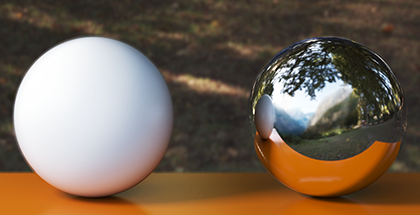
In 3D applications, this is called global illumination.
The sphere on the left is a white material. Even though it’s not a reflective material, you can see shades of green, yellow, and brown being reflected on to the sphere by the scene around it. There are also orange shadows on the under side of the sphere being reflected by the surface where it is resting. This is how light and environment behave in real life and this is how “flat” objects can be thought of in Yosemite.
The sphere on the right is a chrome material. Because it is chrome, it reflects the scene and environment around it and acts as mirror — the way chrome acts in a physical environment. This is how the metallic 3D objects now look in Yosemite, but since they are aluminum — not chrome — the effect is more diffused and subtle.
It’s as though Apple used the Yosemite wallpaper as the environment map for the new icons. Subtle color details like this can be seen throughout the system. This attention to detail in your own icons will go a long way to make your icons feel at home.
Your Turn
The shape, grid, lighting, and details are important but it’s important to remember these are just guidelines. A good designer knows when to break from the system and will still make it work. If you’re new to icon design, I recommend starting with the system until you understand it.
Pay attention to the overall shape and tone of the icon, think of it as an object with materials. Simplify and look at your icon along side other icons. Not much has changed — just a visual update with a more consistent system.
All of the icons shown here were a logical step from the Mavericks versions. Unifying those icons with a shape system makes sense. However, not all apps will, or should, fit the system. Custom shapes stand out and are easier to pick out in the dock. In those instances, pay close attention to the angle, lighting, and overall size of the icon.
Now go get started on your Yosemite icon! I’ve created a PSD with the shapes and grid as a starting point.
The original version of this article incorrectly identified “Global Illumination” as “Ambient Occlusion”. We have corrected the article in place and thank everyone who brought this error to our attention.