During the four years I have been doing Android development, on projects both big and small, there’s been one common problem: design. Even on teams which have dedicated UX/UI designers, or on teams where iOS drives the Android design, I find myself making the same case over and over: advocating to do Android the right way. It’s important to make an app look, feel, and function natively on Android.
More times than not, when I relay this issue to project leads, I am met with the same response: “It doesn’t matter, no big deal.” I am here to tell you it does matter — and I want to walk you through some examples why.
From a user perspective
Hardware Back Buttons Are a Thing
Navigation on iOS is done in the app using UI buttons, whereas navigation on Android is done with both UI controls and the hardware buttons on the device. Many times the app must be aware of the user hitting the back button on Android. Pressing the back button normally takes the user back to the previous page. However, in abnormal situations there must be a discussion of the UI and app flow. For example, if the app has several on-boarding screens, and upon completion of the on-boarding, the user does not need or want to go back to the start of on-boarding, a discussion is in order to determine what happens if an Android user hits the back button in this situation. Where should the app take the user? This is not an issue iOS users face — so it is a new design challenge for Android navigational flows.
In order to navigate back in an iOS app, the user normally looks for a back arrow to hit, or can use an edge swipe. That’s where pressing the soft/hardware back button serves the same purpose as the software back buttons do in iOS.
Some app designs call for an “X” button to leave a page or modal. While this is visually appealing, and even necessary for iOS, this button simply should not be on the Android UI. Android users naturally and intuitively hit the hardware back button to exit a dialog without buttons, so there is no need to introduce an “X” or close button in the design.
Examples of an X button to exit a page from some well known social Android apps (Twitter and Instagram) which are not needed.

Slack gets it right by modifying the design to stay true to the platform.
iOS (left) vs Android (right)
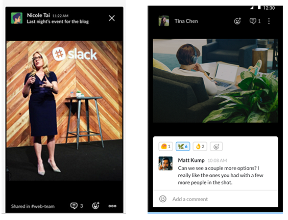
iOS navigation patterns may frustrate Android users
It is very important for designers, developers, and product owners to consider that iOS and Android have different native standards when it comes to navigation patterns and screen transitions, and to be aware of the most current information available on these things. Google’s Material Design documentation does a fantastic job of detailing screen transition use, and applying proper navigation patterns to your app.
Android users are accustomed to certain navigation and UI patterns. Most apps adhere and keep the user’s experience consistent with Android’s UI patterns.
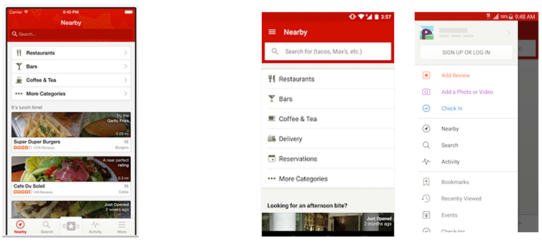
iOS navigation often uses the bottom tab bar for navigating throughout the app. For Android users this is inconsistent with the standard design language and may frustrate users at first glance. It is better not to utilize the bottom tab bar options and present the navigation options under the hamburger icon which is standard on Android. A great example is how Yelp did this for both to its mobile apps. (Starting in Android N, Google is introducing bottom navigation. However there is no release date on when it will be available to the public.)
Yelp iOS with bottom nav options (left) , Android with nav option under the hamburger icon (right).
If Android is a serious platform for your company, you need to hire designers who are familiar with iPhone and Android designs languages. Platform differences are not only the way things look, but also differences in the structure and flow of the app. Designers need to spend some time getting familiar with the Android platform through hands on experience with Android devices.
From a developer perspective
Custom views for standard iOS controls
Often times, designers expect each element to look the same across platforms, and this requires additional development effort to achieve the same default design as iOS. The more complicated use cases are default controls such as radio buttons, checkboxes, toggles, etc which require a custom view implementation in order to achieve the right “iOS” look. An example would be date pickers. Android users typically are not familiar with slot machine reel style date selections. Custom views can get complex which increases work load, complexity, and alienates your app design on Android — all with a negative benefit for Android users.
Standard Android Controls
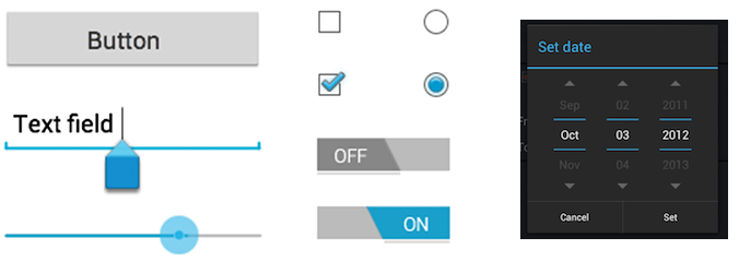
Standard iOS Controls

iOS/Android Animations are not created equal
iOS animation frameworks seem like the platform was built with animation in mind. In contrast, Android animation frameworks seem to be built as an afterthought. Android’s animation framework is not nearly as robust as iOS. A very similar comparison would be iOS AV Foundation, which is leaps and bounds to Android’s camera and bitmap apis. If animation is required in the design, the UX designer needs to sit down with the developer to see what is achievable in the timeframe of the project.
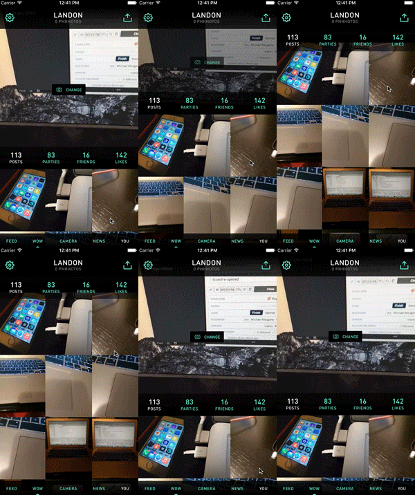
One of my previous projects had a complex profile page which included your profile pic and other information. The page required a sticky header on a list view along squishing/scaling/fading your profile pic (see gif for visual). The animation could be done at a somewhat high level using the built-in iOS framework. Android requires a deeper or lower level approach by extending/customize core view components provided. Not sure how long it took my iOS counterpart, but I am positive it took me much longer to implement this effect on Android. I enjoyed the challenge and everything turned out, however it wasn’t as simple and quick as the iOS development side.
Sharing experience
iOS uses share sheet which allows the developer to customize the share sheet menu to a degree. Often times, designers will want this share experience to port exactly over to the Android app as much as possible. Android handles the share experience by calling out to any app that can share the content type. It would be unnecessary to spend time creating unique share experience for your Android users.
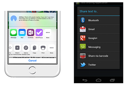
Custom experiences have their place in the world, however, the standards are almost always the way to go. Sticking with the standards creates time savings for the product team, by not having to toil over a custom share experience, and for your app users not having to spend extra time learning your unique share experience.
Android the right way
The message is not that Android development is harder — Android is simply different in design and development when compared to iOS, and needs to be considered as such from the beginning. I encourage product owners and designers to lean on experienced Android developers for recommendations which will help avoid needless development cycles during the project. Project managers and stakeholders must take into consideration timelines for Android production may or may not match the iOS timelines feature-for-feature when things are done correctly.
Doing things correctly fares better for your customers than simply trying to mirror what was done on iOS.
Investing in Android requires patience and a good understanding of the platform. Remember Android has at least 50% of the U.S smartphone market, if done correctly you will not only gain the attention of your Android customer base, but you can win their affection. Don’t leave half the smartphone market behind just to save money on design. Android users always notice.


