Introduction
Collection views are extremely versatile - there’s even speculation that the venerable UITableView will be soft-deprecated in favour of its more flexible and powerful cousin. But this versatility comes with a price - collection views, and particularly collection view layouts, can become complicated, and the official documentation for some of the more interesting areas is a little… sparse.
Apple frequently tells you to use directly or subclass the flow layout. The flow layout does a lot of heavy lifting for you when you’re dealing with a flexible number of arbitrarily sized items that need to make room for each other. This covers a lot of use cases, and delivers you the following advanced features for free, or almost free:
- Layout of your items into organised rows and columns, with configurable spacing and alignment
- Section headers and footers, with the option to pin these to the visible bounds to make them “float”
- Automatic resizing to deal with cells that size themselves using auto layout
However, getting things for free usually has a price - in this case, the price is a lack of decent understanding of what a collection view layout does or how it works. The flow layout achieves all it does using the same API that is available to you as a third party developer, but it’s not immediately clear how you would create something like the flow layout yourself.
You’re going to learn about the following interesting but poorly documented areas of collection view layouts:
- How a layout works, and the layout lifecycle
- Decoration views
- Custom invalidation contexts and their uses for floating views and autoresizing
Custom Layouts
If your layout is more complicated than “fit these cells in a line, breaking when you get to the edge of the screen”, or you’re not happy with the decisions that flow layout makes about your cells (for example, the forced “justification” of cells) then you may want to consider a custom layout.
If your layout uses regular, predictable, but non-uniform sizes then a custom layout is also a good choice. Don’t use the flow layout just to get some of its features, like floating section headers. These features are not difficult to implement yourself.
Building a custom layout can be complex, and it’s important to be able to quickly iterate when working. Xcode playgrounds are an excellent place to develop a custom layout. Using the live view feature you can add a collection view to the assistant area and watch it develop as you work on your layout. It’s easy to stand up a simple data source object which returns plain or very simple cells, which you could perhaps tint with colours to let you know where things are going.
Accompanying this article is an Xcode playground demonstrating the code and principles discussed. The layouts included in the playground are designed with code readability and learning in mind, to use them in production may require performance optimisations or other changes. The Previewing page of the playground demonstrates how to make an interactive, scrollable collection view right there in your playground.
One drawback of the playgrounds approach is that things can get worryingly slow - for some layouts there can be a lot of back and forth as attributes are invalidated and recalculated, and you may find yourself thinking that you’re developing something unusable. However, most of this is due to the nature of playgrounds, particularly the live output and logging of each line of code in the page. If you encounter this issue then you can move your layout code to the Sources folder of your playground, where it will be compiled, and will run much faster.
Building a layout subclass
UICollectionViewLayout is an abstract class, and any subclass has to implement a few documented methods for it to be usable:
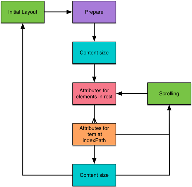
collectionViewContentSize: Returns the size of the entire collection view’s content. It is called periodically during scroll events and after invalidation or updating the contents of the collection view.layoutAttributesForElements(in:): Returns the layout attribute objects relating to the cells, supplementary views and decoration views that are within the passed inCGRect. It is called at regular intervals during scrolling. You can’t make any assumptions about the rect that will be passed in - it may be the visible bounds, or a larger area if the collection view is prefetching, or any other area.layoutAttributesForItem(at:): Returns the layout attributes object for a cell at the specified index path.layoutAttributesForSupplementaryView(ofKind: at:)andlayoutAttributesForDecorationView(ofKind: at:): Returns the layout attributes for supplementary and decoration views, if your layout supports those views.shouldInvalidateLayout(forBoundsChange:): The default implementation of this method returnsfalse, but if you need to update your layout on a bounds change, you should implement this method. Note that scrolling, as well as resizing (such as a screen rotation event) counts as a bounds change.
There is a very simple layout in the Custom Layout page of the playground. You can watch when and how often each method is called by scrolling. This diagram summarises the process:

Decoration Views
Your layout can return attributes for three different kinds of views:
- Cells are the main components of a collection view, and the one you are probably most familiar with. A cell typically represents a specific item in the model that the collection view is displaying.
- Supplementary views are related to the model, but not typically representative of a single item in the model. Section headers are a good example of a supplementary view. The collection view datasource is responsible for configuring supplementary views.
- Decoration views are not related to the model - in fact, they are owned completely by the layout. Nothing about the decoration views is exposed to anything outside the layout object, so it is slightly unintuitive to decide how or when to use them. A decoration view would be something like a grid line, or an action button that applies to the entire layout.
To add decoration views to a layout, do the following:
- Register the decoration views with the layout against a “kind” - this is a string, similar to a reuse identifier for cells. You do this when the layout is initialised.
- Include decoration view attributes in layoutAttributesForElements(in:). Once you return some decoration attributes, that’s the last chance you’ll ever have to do anything with the decoration view. You can’t configure it, you don’t get a reference to it, you can’t add or remove it from the collection view. If you want anything interesting at all to happen with your decoration view, then you need to use a custom layout attributes class and send information that way.
The playground page Decoration View shows a very simple decoration view - all it adds is a single blue square in the top right of the collection view. The blue square moves along with the scrolling.
Adding supplementary views is almost identical, except that your datasource will also get a chance to configure each supplementary view. The decision between using a decoration view or a supplementary view is therefore pretty simple - if you require an opportunity to directly configure each view as it is added, then you’re better off using supplementary views.
Floating views
That decoration view is pretty boring. How would you make it “float” on the layout, so it was always in the top right corner regardless of the scroll position? You can’t just amend the frame in layoutAttributesForElements(in:) - not only is that method not called often enough, it will also cause a runtime exception, as you’re modifying layout attributes without invalidating them. You could invalidate the layout on every bounds change and recalculate every frame, but that’s pretty inefficient. The secret is to use an invalidation context.
There is a lot of information in a collection view layout, and it’s not efficient to have to recalculate the entire layout just because a couple of aspects might need updating. To help with this, you can supply an invalidation context which you can use to specify which parts of the layout need recalculating. Think of your layout as a Lego model - if you wanted to alter one part of it, you don’t need to tear the whole thing down and rebuild, you can just tweak one part!
To make the decoration view in the last example float, you have to update its position when the collection view is scrolled. The cell positions are still valid, since they are moving along with the scroll. Using an invalidation context you can say that only the floating view will need its attributes updating when the bounds of the collection view changes (scrolling constitutes a bounds change).
The Floating Decoration View page of the playground shows how to implement a floating view. In summary:
- Calculate the frame appropriate to the collection view’s bounds when the layout attributes for the view are generated (in
layoutAttributesForDecorationView(ofKind: at)in this case). If you stopped at this point, your collection view would crash on scrolling as you’re changing attributes without telling it. - Return
trueforshouldInvalidateLayout(forBoundsChange:)- this will then ask your layout for an invalidation context specific for that bounds change. If you stopped at this point, the entire layout would be regenerated every time the user scrolled. - Implement
invalidationContext(forBoundsChange:)- in this method you check to see if the bounds is the same size (this distinguishes between scrolling and, say, an orientation change). If the size is the same then you can invalidate specific items in the context, which will then allow the collection view to just ask for those invalidated items and update the appropriate views only. This is why there are separate methods for returning the attributes for a specific view, and all attributes in a specific rect, to give you granularity for layout updates.
You can invalidate the layouts of multiple views within a single invalidation context. That’s what happens in the final part of the article.
Self-sizing cells
Invalidation contexts are also used when implementing auto sizing cells in a collection view, and when interactively dragging and dropping cells to re-order them. In fact, much of the “magic” that the flow layout performs for you is done using invalidation contexts, so it’s important to understand how they work.
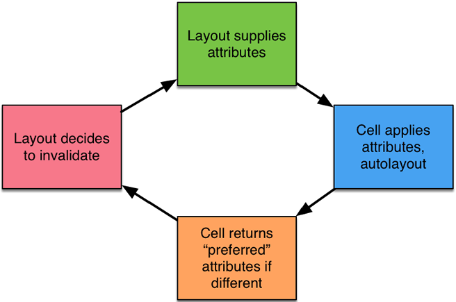
Self-sizing views are implemented using a rather elaborate dance:
- The layout supplies attributes using
...Elements(in:)and...Item(at:) - The view is dequeued and applies those attributes, using
apply(_:) - The view is configured by the data source, at
...cellForItemAt: - The view is then asked for its opinion on its layout, using
preferredLayoutAttributesFitting(_:). The default implementation of this method simply applies any autolayout constraints to the configured view. If the size is different, it will return a preferred set of attributes. - The preferred attributes are sent back to the layout, which can choose to ignore them, or invalidate the layout, in
shouldInvalidateLayout( forPreferredLayoutAttributes: withOriginalAttributes). - If the layout chooses to invalidate, an invalidation context is created, allowing the appropriate elements to be marked as invalid and new attributes to be generated.
- … repeat until all preferred layouts match or are ignored.
This diagram summarises the process:

The Autosizing page of the playground shows an implementation of this. Notice that in this case the layout is in the Sources folder, because autosizing involves many iterations back and forth, and having that code in the playground becomes very slow.
Summary
Collection views are a fundamental component of iOS applications, and are likely to become more so in the future. The ability to build interesting and performant layouts will give your apps an edge, but to do that you need to learn how the fundamental mechanisms of a layout fit together.


