A large part of UIKit involves putting stuff in boxes and showing it to the user. As the framework (and the devices that it runs on) has evolved, this process has become a little more complicated. This article discusses two related but separate concepts involving layout in your apps: The safe area and layout margins.
Safe Area
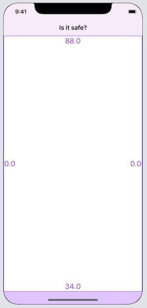
The safe area is a rectangle, inset from the edges of the screen, where the user is guaranteed to be able to see content. They begin at the window’s root view controller, and can be amended by each view controller in the hierarchy. On an iPhone SE, the safe area will usually just account for the status bar. The following screenshots show the unsafe areas of the screen and their distance from each edge:
On an iPhone X, the safe area includes allowances for the sensor housing and home indicator:
UINavigationController adds to the safe area for its navigation bar:
The safe area is available as a layout guide in interface builder, or as the safeAreaLayoutGuide of a view. The safe area layout guide of a view is calculated based on the view’s position relative to the superview’s safe area layout guide:
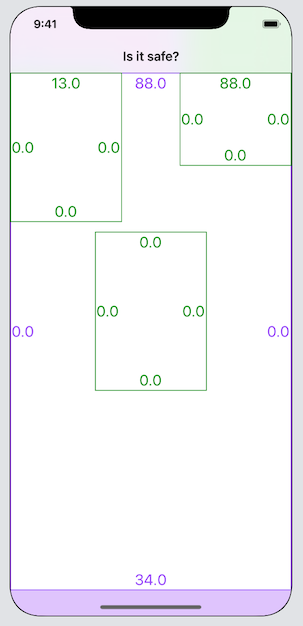
In this image, there are three green subviews, each indicating their safe area. The central one is entirely within the superview’s safe area, so the entire view is safe. The top left one extends slightly beyond the superview’s safe area, so its safe area is inset from the top by the overlapping amount. The top right view is aligned with the superview’s top edge, so the safe area inset at the top is identical to that of the superview.
Interestingly, if the top right view is moved still further up, the safe area inset does not continue to expand. It is capped at the size of the superview’s safe area inset, which becomes important when animating views on and off screen and using scroll views.
If you want to add to the safe area, for example if you display a tool palette, then you can set additionalSafeAreaInsets on your view controller.
Layout margins
Layout margins represent the desired spacing between a view’s edges and any subviews.
Imagine a container with a label in it. You want the container to run right to the edges of its superview, but the label would look bad right up against the edge:
You could solve this by pinning the label a fixed distance from the edge of the container. A better solution is to pin the label to the container’s layout margins.
Using layout margins has the following advantages:
- Your intention is more obvious - a distance of 0 from a margin is more meaningful than a distance of 10 from the edge
- You can take advantage of system-supplied margin sizes appropriate to the current device
- You can amend your layout simply by adjusting the margins, instead of adjusting individual constraints
- A view can infer margin information from its environment, giving you free adaptability to the iPad Mini Notch or whatever other device type arrives next.
Layout margins are A Good Thing. How do they work?
Default margins
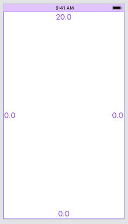
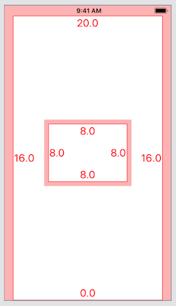
All views are given default layout margins by the system. For the root view of a full-screen view controller, they vary from device to device. The following image shows the layout margins of the default view of an iPhone SE:
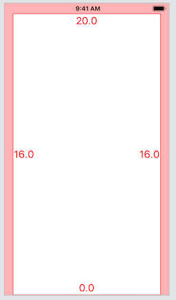
It has 20 points at the top, none at the bottom, and 16 on either edge. The side padding comes from the systemMinimumLayoutMargins property of the view controller.
Adding a subview shows that non-root views have different defaults:
The subview has margins of 8 points on all edges. This is the system default, and it doesn’t change between devices. If you’re not happy with the default margins of a view, you can set them yourself, either in interface builder or in code. Prefer to use the directionalLayoutMargins property, which takes the language direction into account (leading / trailing instead of left / right). You can change this at design time or while your application is running. If you want to amend the side margins of the root view of a view controller to something smaller than the system minimums, set viewRespectsSystemMinimumLayoutMargins on your view controller to false.
Context-aware margins
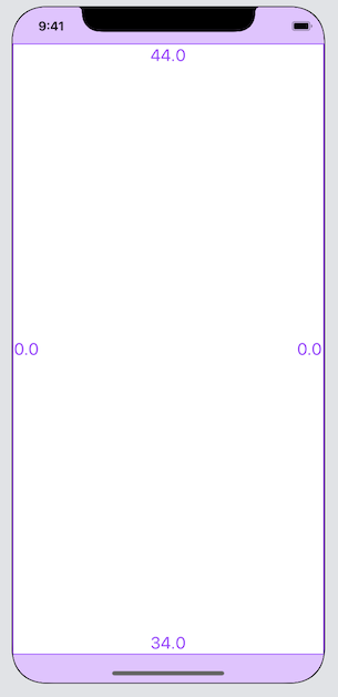
The 20 point margin at the top of the root view isn’t a fixed value. It’s using the safe area insets, mentioned above. Adding a navigation bar at the top and a toolbar at the bottom affects the margins:
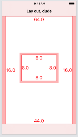
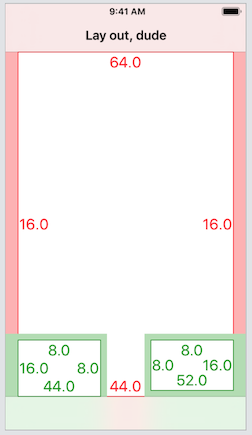
The top margin is now 64 points, and the bottom is 44. Let’s go safe area bonkers and run on a notched, plus-sized device… in landscape 😎:
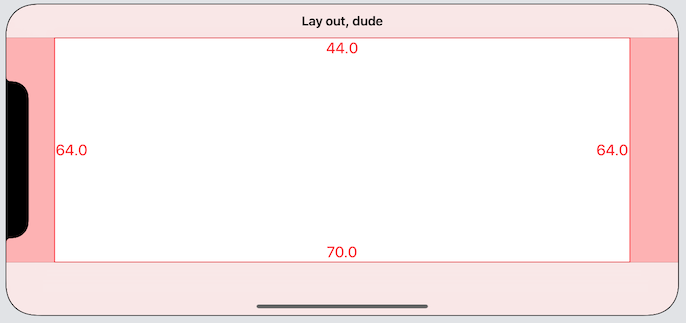
That’s 44 points at the top, 64 to the left and right, and 70 at the bottom. These numbers are all coming from the safe area of the surrounding view controller.
By default, the layout margins of a view take the safe area into account. This is the insetsLayoutMarginsFromSafeArea property, or Safe Area Relative Margins checkbox in interface builder. To visualise this relationship, here are two subviews, both pinned to the bottom of the view controller’s view. The view on the right is using safe area relative margins, the view on the left is not:
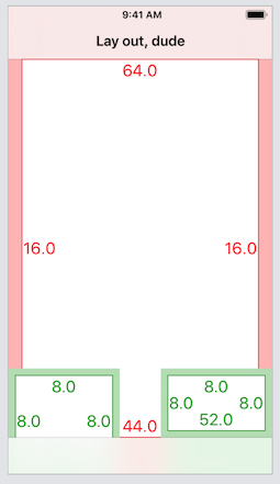
Notice that the bottom margins for the view on the left are actually below the toolbar, because it is ignoring the safe area. If the view is using safe area relative margins, then the layout margins will be extended so that they are the correct distance from the edge of the safe area.
You may also notice that the margins by the edge of the screen are actually smaller than those of the main view - 8 points versus 16. That’s because there’s another place views can get information about their margins from - the margins of the superview. That’s controlled by preservesSuperviewLayoutMargins, or Preserve Superview Margins in interface builder. Unlike the similar safe area setting, this is off by default. Turning it on for the two subviews yields the following:
Both views now have a margin of 16 points from the edge of the device. The left view, which is ignoring the safe area but preserving the superview’s margins, has a bottom margin now of 44, which is the same as the superview. The right view, which is using safe area relative margins, has a bottom margin of 52 points (44 points from the safe area, and 8 points from its own margins). Preserving superview margins means that the layout margins will be at least the size of the superview’s margins. It’s a subtle difference from the safe area setting.
Putting it all together
For any given view, the effective layout margins will be derived as follows:
- Obtain the default margin or custom margin, if set
- If the view is using safe area relative margins, and the view’s frame extends outside the safe area, then add the safe area to any affected margins
- If the view is preserving superview margins, and the view’s frame extends outside the superview’s layout margins, then make sure the margin at any affected edge is at least the size of the superview’s margin.
Using margins
The examples above should indicate that margins are a very sensible thing to use for positioning your content. You should be able to pin views to the layout margins and then not really have to worry about which device you are running on.
Unfortunately, Apple rather shot itself in the foot when layout margins were introduced, making them on by default in interface builder, which led to a lot of developers angrily turning them off and vowing never to use them. Developers can be like that. But now you know what margins are and when and where they can be useful, you can happily use them again. In Interface Builder, just make sure the “Constrain to margins” option is checked, or you can toggle it at any time by editing the constraint. In code, you have to use the layoutMarginsGuide instead of the view:
// Pin to the superview's edge with some spacing, that you'll get
// the wrong way round at first because sometimes it's negative
subview.leadingAnchor.constraint(equalTo: superview.leadingAnchor, constant: 10)
// Pin to the superview's margins, ahhh, lovely
subview.leadingAnchor.constraint(equalTo: superview.layoutMarginsGuide.leadingAnchor)
There are some UIKit classes with built-in smarts about margins and safe areas. UIStackView has a property, isLayoutMarginsRelativeArrangement, which tells the stack to take margins into account when laying out the arrangedSubviews. It’s false by default. This can save you adding arbitrary padding around a stack view.
UIScrollView, which has been a pain point since iOS 7, when we were supposed to start messing around with content insets, has some new features which should make things easier - a contentInsetAdjustmentBehavior property which tells the scroll view how to take surrounding safe areas into account, and a separation of user-applied content inset and system-applied content inset which should remove some headaches for developers who like to do fancy things with scroll views.
Further information
WWDC 2018 session 235 covers the topics in this post in more detail, and is highly recommended.