In this article we will be creating a card with a small animation using SwiftUI, turning that card into a component to organize our code, and then setting up Binding so that we can keep the animation we’ve created on the card.
Creating Components is very important, it’s what keeps your code clean and improves your apps performance. @Binding is used to link a specific state on a certain page.
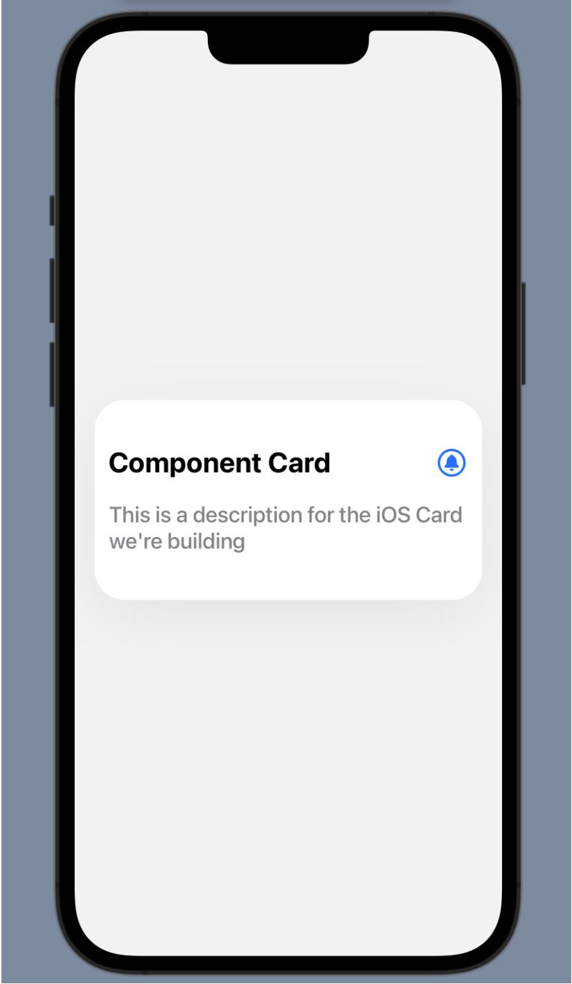
The component view above is what we will build. We’ll begin by setting up the card itself. The first thing we want to do is add a ZStack that will host our card and act as the background of the page.
	import SwiftUI

	struct CodeSnippet: View {
		var body: some View {
			ZStack {
				// Card Container & Background
			}
		}
	}

	struct CodeSnippet_Previews: PreviewProvider {
		static var previews: some View {
			CodeSnippet()
		}
	}


	Next, we’ll add a `VStack`, which will be the actual card.


	import SwiftUI

	struct CodeSnippet: View {
		var body: some View {
			ZStack {
				// Card Container & Background
				VStack {
					 // Card
				}
			}
		}
	}

	struct CodeSnippet_Previews: PreviewProvider {
		static var previews: some View {
			CodeSnippet()
		}
	}
Working within the VStack for the card’s content, we’ll next add an HStack to hold the title of our card and the icon we will animate later.
import SwiftUI

struct CodeSnippet: View {
	var body: some View {
		ZStack {
			// Card Container & Background
			VStack {
				// Card
				HStack {
					// Top Card Content
				}
			}
		}
	}
}

struct CodeSnippet_Previews: PreviewProvider {
	static var previews: some View {
		CodeSnippet()
	}
}
Now that we have our nested set of stacks, we’ll add a title Text and an icon Image to the HStack as well as a Text for the card’s description to the VStack. We’ll also set up a preview using a PreviewProvider.
This is what you should have so far:
import SwiftUI

struct CodeSnippet: View {
	var body: some View {
		ZStack {
			// Card Container & Background
			VStack {
				// Card
				HStack {
					// Top Card Content
					Text("Component Card")
					Image(systemName: "bell.circle")
				}

				Text("This is a description for the iOS Card we're building")
			}
		}
	}
}

struct CodeSnippet_Previews: PreviewProvider {
	static var previews: some View {
		CodeSnippet()
	}
}
Styling the Card
The contents of our card are in place, but it doesn’t look like much. We’ll add some design to our code next to make it look like a card. First, let’s add one background color to the page and another background color to our card.
import SwiftUI

struct CodeSnippet: View {
	var body: some View {
		ZStack {
			// Card Container & Background

			Color.gray.opacity(0.1)
				.edgesIgnoringSafeArea(.all)

			VStack {
				// Card
				HStack {
					// Top Card Content
					Text("Component Card")
					Image(systemName: "bell.circle")
				}

				Text("This is a description for the iOS Card we're building")
			}
			.background(Color.white)
		}
	}
}

struct CodeSnippet_Previews: PreviewProvider {
	static var previews: some View {
		CodeSnippet()
	}
}
Here we added a Color.gray.opacity(0.1) modifier to our ZStack along with an .edgesIgnoringSafeArea(.all) modifier so that the Color can take up the whole background. We also added a .background(Color.white) modifier to the card.
Let’s further refine the design of our card by adding .frame and .padding modifiers.
import SwiftUI

struct CodeSnippet: View {
	var body: some View {
		ZStack {
			// Card Container & Background

			Color.gray.opacity(0.1)
				.edgesIgnoringSafeArea(.all)

			VStack {
				// Card
				HStack {
					// Top Card Content
					Text("Component Card")
					Image(systemName: "bell.circle")
				}

				Text("This is a description for the iOS Card we're building")
			}
			.frame(maxWidth: .infinity)
			.frame(height: 200)
			.background(Color.white)
			.padding(.horizontal, 20)
		}
	}
}

struct CodeSnippet_Previews: PreviewProvider {
	static var previews: some View {
		CodeSnippet()
	}
}
Our design is starting to come together! The next thing to do is to start styling our text and the icon inside the card.
VStack {
	// Card
	HStack {
		// Top Card Content
		Text("Component Card")
			.font(.system(size: 28, weight: .bold))
		Spacer()
		Image(systemName: "bell.circle")
			.font(.system(size: 28))
			.foregroundColor(.blue)
	}

	Text("This is a description for the iOS Card we're building")
		.font(.system(size: 22, weight: .medium))
		.foregroundColor(.gray)
		.padding(.horizontal, 4)
		.padding(.top, 4)
}
We’ve formatted the text and the icon, and we used a Spacer inside the HStack to separate the text and the icon.
Now that the contents of the card are looking good, let’s add a couple styles to the card itself.
...
 }
			.frame(maxWidth: .infinity)
			.frame(height: 200)
			.background(Color.white)
			.mask(RoundedRectangle(cornerRadius: 30))
			.shadow(color: Color.black.opacity(0.05), radius: 30, y:15)
			.padding(.horizontal, 20)
		}
	}
}
We’ve added .mask and .shadow modifiers to the VStack that represents our card.
Our design is complete! Now let’s dive into state.
Using State for Animations
We will be adding an animation for when the user taps the notification icon. First, we need to create a state object to control the animation.
struct CodeSnippet: View {

@State var notifications = false

var body: some View {
	ZStack {
		// Card Container & Background

		Color.gray.opacity(0.1)
			.edgesIgnoringSafeArea(.all)

}
Next we have to set up what happens when we toggle this state. We’re going to add notifications ? “bell.circle.fill” : “bell.circle” to the Image that represents our notification icon. When a user toggles the notification state, the bell icon will change from a stroke icon to a filled icon. You will see this come to life when we add the .onTapGesture to our image next.
HStack {
	// Top Card Content
	Text("Component Card")
		.font(.system(size: 28, weight: .bold))
	Spacer()
	Image(systemName: notifications ? "bell.circle.fill ": "bell.circle")
		.font(.system(size: 28))
		.foregroundColor(.blue)
}
Now let’s apply the .onTapGesture modifier.
HStack {
	// Top Card Content
	Text("Component Card")
		.font(.system(size: 28, weight: .bold))
	Spacer()
	Image(systemName: notifications ? "bell.circle.fill ": "bell.circle")
		.font(.system(size: 28))
		.foregroundColor(.blue)
		.onTapGesture {
			notifications.toggle()
		}
}
Tap play on your preview, then tap the notification icon. You will see it change from stroked to filled.
Congratulations! We’ve successfully designed a card using SwiftUI, added state to our card, and added an onTapGesture to toggle this state. The last thing we’ll do is turn the card into a component and bind the state we just created to the component.
To make these changes, we are going to move our VStack code into a new file. Create a new group in your Xcode file called Components. Add a new file into that group called Card.
Back in our original file, let’s cut the VStack code so we can paste it in the new file. To make this easier, Command-click on the first VStack bracket and select “Fold.” Your code should look like this:
VStack {
		// Card
		HStack {
			// Top Card Content
			Text("Component Card")
				.font(.system(size: 28, weight: .bold))
			Spacer()
			Image(systemName: notifications ? "bell.circle.fill ": "bell.circle")
				.font(.system(size: 28))
				.foregroundColor(.blue)
				.onTapGesture {
					notifications.toggle()
				}
		}

		Text("This is a description for the iOS Card we're building")
			.font(.system(size: 22, weight: .medium))
			.foregroundColor(.gray)
			.padding(.horizontal, 4)
			.padding(.top, 4)
		}
		.frame(maxWidth: .infinity)
		.frame(height: 200)
		.background(Color.white)
		.mask(RoundedRectangle(cornerRadius: 30))
		.shadow(color: Color.black.opacity(0.05), radius: 30, y:15)
		.padding(.horizontal, 20)
		}
	}
}
Now highlight the VStack code, cut it, and paste it into the new Card file you just created. Your new Card file should look something like this. Don’t worry - we will be fixing the errors you see in a moment, with just one line of code.
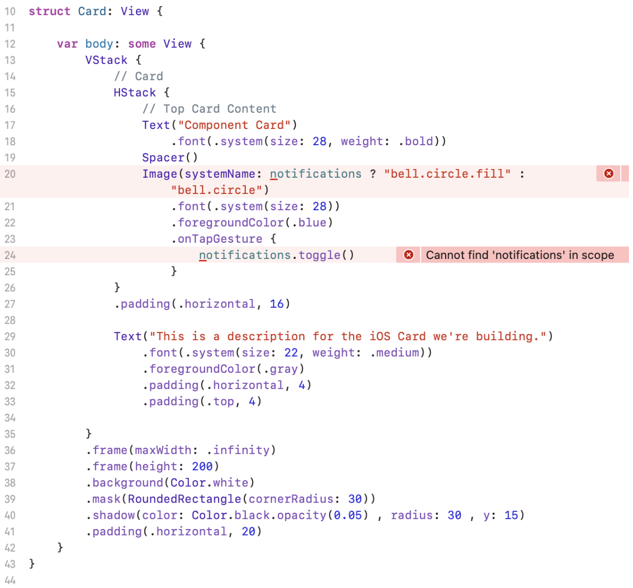
To fix these errors, all we have to do is add Binding for our notification state to this new Card file. Here’s what it should look like:
import SwiftUI

struct Card: View {

	@Binding var notifications: Bool

	var body: some View {

		VStack {
			// Card
			HStack {
				// Top Card Content
				Text("Component Card")
					.font(.system(size: 28, weight: .bold))
				Spacer()
				Image(systemName: notifications ? "bell.circle.fill ": "bell.circle")
					.font(.system(size: 28))
					.foregroundColor(.blue)
					.onTapGesture {
						notifications.toggle()
					}
			}

			Text("This is a description for the iOS Card we're building")
				.font(.system(size: 22, weight: .medium))
				.foregroundColor(.gray)
				.padding(.horizontal, 4)
				.padding(.top, 4)
		}
		.frame(maxWidth: .infinity)
		.frame(height: 200)
		.background(Color.white)
		.mask(RoundedRectangle(cornerRadius: 30))
		.shadow(color: Color.black.opacity(0.05), radius: 30, y:15)
		.padding(.horizontal, 20)
	}
}
And that’s it! We’ve successfully designed a card using SwiftUI, turned the card into a component, and added state and binding.
I hope this tutorial was helpful. Thank you for tuning in!