This year reminds me a lot of 2009. It had been 6 months since the launch of the iPhone SDK and designers were starting to realize the challenges facing them on the iPhone. The size of the screen, combined with an all-touch user interface, posed challenges foreign to designers accustomed to creating interfaces for the desktop and web. Mockups felt oversized and gaudy on the computer, only to look undersized and unusable on the iPhone.
I remember those challenges well, especially in mid-2009 when I created Briefs to give a practical solution for designers to test and validate their designs on the iPhone. Now in 2015, we’re presented with yet another small screen to design for — and designers are once again re-learning the lessons of 2009.
It feels only right to release a new version of Briefs to help out.
![]()
Introducing Briefs 1.3 Public Beta
We’ve included a lot in Briefs 1.3. There are performance enhancements and bug fixes aplenty. We’ve added support for the iPhones 6 and 6 Plus — even a custom template so you can target a specific device (Android, Windows Phone, or something totally new). But the main course is the watch templates. There are plenty of tools that let you visualize your design and approximate the actual size, but no tool allows you to test interaction.
Since the templates and resources from Apple for the Watch are still pre-release (and likely to change), we can’t ship a final version of Briefs 1.3 just yet. What we do have is working well enough that we wanted to share it publicly. Introducing Briefs 1.3b1.
Briefs is more than a way to mirror your designs on an iOS device. It’s about testing tap targets and observing finger shadows while you’re interacting with the device. None of us, outside of Apple, know what it’s like to use the Apple Watch, but we believe Briefs 1.3 will bring you much closer to knowing if your design will work. There are many prototyping tools that let you refine your animations better than Briefs, but no tool matches Briefs when it comes to organizing and understanding the flow of your application. On a new platform such as the Apple Watch, organization and base interaction are of the highest importance. Understanding the constraints is the key to understanding a platform.
Instead of walking through features specific to the beta (full release notes can be found here), I want to break down the three main components of the Apple Watch experience and show you how to use Briefs to design them. If you’d like the brief I use in my examples it can be downloaded so you can follow along. You’ll need to download Briefs 1.3b1 here to open the file.
Note: If you’ve bought Briefs from the Mac App Store, this version will not overwrite the Mac App Store version of Briefs on your machine. It should unlock automatically when you first open it, but you won’t have access to iCloud until we ship the final version.
Before We Get Started
To start designing Apple Watch apps with Briefs, you should have a few things:
- A browser open to the Apple Watch Human Interface Guidelines.
- You should download the Apple Watch Design Resources included at the bottom of the WatchKit Developer Guide.
- Once you have the design resources, you should install the San Francisco typeface. Briefs can reference that typeface, but it must be installed by you. The license for San Francisco forbids us from bundling it with our application.
- An image editor of your choice, to create the assets for the brief. Apple includes templates for both Photoshop and Sketch, so I’d recommend one of those. Since the templates are covered under a pre-release agreement, we are unable to provide an Apple Watch asset library at this time.
- You should also download the latest version of Briefscase (1.3.1 as of this writing) installed on your iPhone or iPad. I recommend an iPhone, since the pixel density of the iPhones 5s and 6 match the density of the Apple Watch. And as I’ll show later, this is a great way to approximate the size of the Watch on wrist. Certain gestures and transitions only work on the device, and Briefscase is a free download, so what are you waiting for?
I include a PSD that I used to create the screens for my brief, but all of the cut assets are already in the brief. The design files are included just for reference. Also, I should mention that all of the characters that appear in the brief are fictional and the functionality of this app is theoretical. You are not James Bond and I am not Q branch.
Designing Notifications
Notifications are the most obvious feature of Apple Watch and the easiest for everyone to understand. But Apple has provided some interesting nuance to notifications. On the surface, they are the easiest component of WatchKit to design.
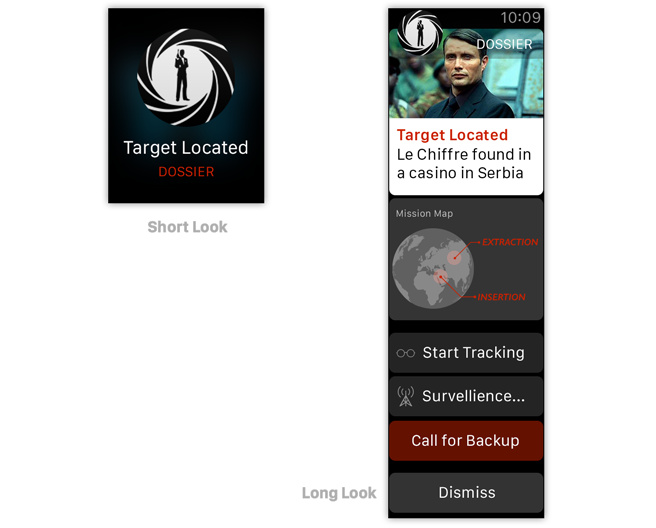
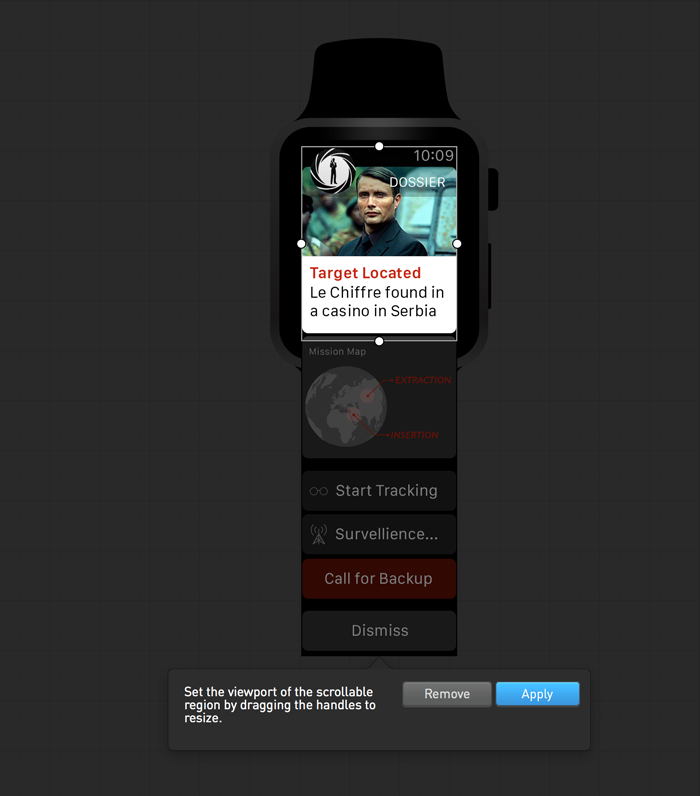
First, there is the difference between a short look notification and long look notification that shows when the user has their arm raised for a certain time interval. How much information do you show? How many actions? And how much can the user scroll through while holding their arm towards their face?
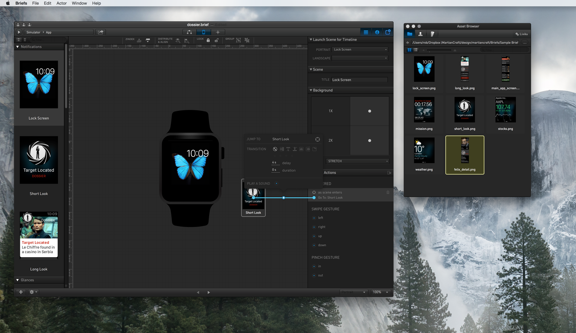
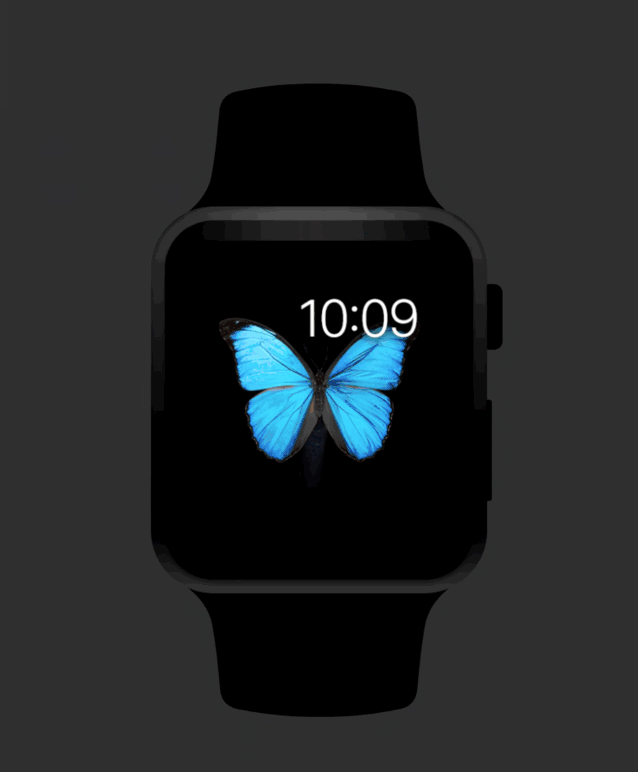
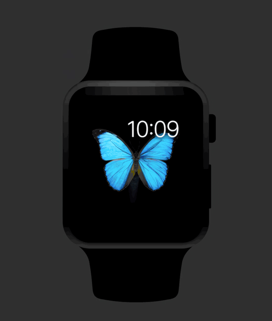
To test this, we create the first timeline in our brief, entitled “Notifications” and start with the lock screen as our first screen. In the following example, our secret agent gets notified of a possible threat nearby and gets additional information about them.
We create three scenes in our timeline: (1) the Lock Screen, (2) Short Look and (3) Long Look. For the Long Look we use a scrollable actor (shown below) to simulate the scroll and test the amount of information that’s feasible for a longer look.
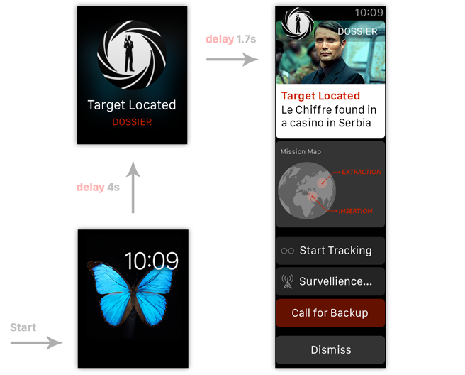
Since notifications are pushed to the watch, there is no direct interaction from the user. Instead we’ll use a scene action on the Lock Screen with a delay that does a goto (with sound) to Short Look. The delay gives us a better approximation of context for the notification. When we run the timeline it’ll show the notification after a delay, like it would appear on the watch in real life.
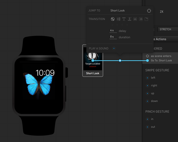
Using a similar scene action on Short Look lets us approximate the transition from short look to long look. We use a goto action in this example, but we could also reveal the Long Look with an opacity action by including the Long Look scrollable actor in the Short Look scene. That would give us a better approximation of the transition, but at the cost of clarity and distinction between the Short Look and the Long Look scenes. By using two scenes, it is more obvious to someone else dissecting the brief what should be in each distinct look.
The final flow comes together and gives you a good idea for how the notifications will look and act. We think this is an important part of understanding your watch design.
Designing Glances
Glances, like notifications, are separate from your main app experience. But unlike notifications, a user performs an action to see your glance. A glance cannot scroll and must only contain one action inside of it. Glances should be information display only, so graphs, charts, maps, etc work best inside of them.
Since it is a separate experience, beyond the app, let’s create a new timeline called “Glance” inside of our brief. We want to provide the appropriate context for our Glance, so we’ll have four scenes: (1) the Home Screen, (2) Weather Glance, (3) Our Glance and (4) Stocks Glance. For the second and fourth scene, we’ll use stock screencaps from Apple’s weather and stocks apps. While we’re cribbing press images from Apple, we’ll use a stock home screen for our Home Screen scene.
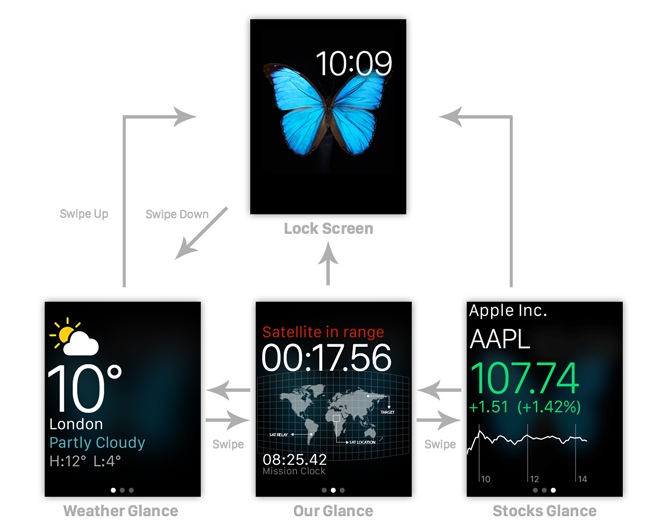
A user can peruse their glances by swiping down from the top of the watch bezel. We’ll want to simulate that so we can understand how our glance becomes visible. We use another scene action, a swipe down on the Home Screen, to trigger a goto action to the Weather Glance. Each glance scene will contain swipe left and swipe right actions to navigate between the three glance scenes, shown below.
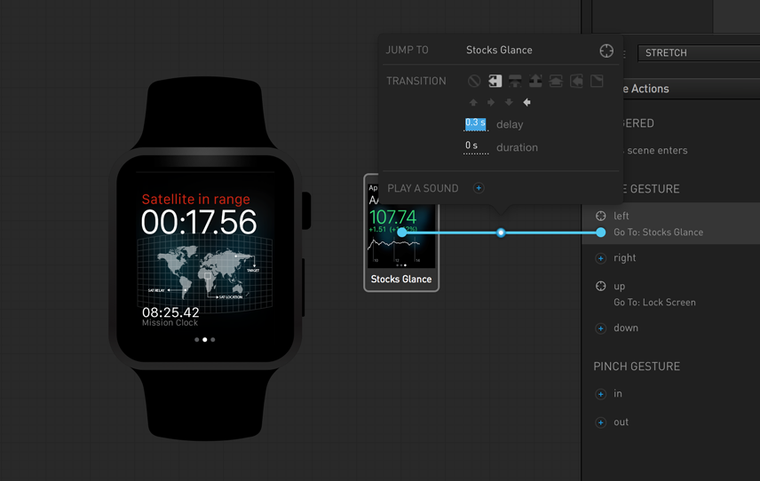
Since Glances are minimally interactive, we don’t have much else to do. Most of our work in this timeline is setting up the glance interaction provided by the system. It may seem silly to some, but most designers are curious how a user will navigate to their UI and the context in which it’ll be shown. Below you can see the whole timeline put together.
Pulling it Together into an App
Beyond notifications and glances, you can design a full application that can be launched from the home screen. You can deep-link your glances and notifications directly into this app. There are three main layouts you can use for your app: (1) Hierarchical, (2) Paginated, and (3) Sheets, i.e., modal. We’ve already seen examples of Paginated and Sheet layouts in the Glances timeline above. For our app timeline, I wanted to showcase using Tables and the Hierarchical layouts.
As you can see, our launch screen is long so we’ll need to scroll. We used a scrollable actor for the long look notification, but there is a downside to using scrollable actors that prevents us from using it here. You make an actor scrollable, but hotspots will not scroll with it which prevents you from tapping more than one item in a scrolling actor. This is a limitation we get a lot of support regarding, so I wanted to share a trick we use internally at MartianCraft to simulate scrolling.
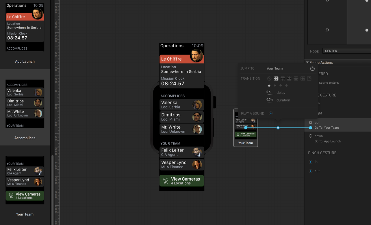
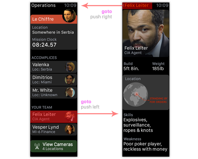
First, we break out large image into three separate scenes: (1) App Launch, (2) Accomplices, and (3) Your Team. On each scene, we position the image so different sections of the image appear in the viewport. We then connect the three scenes with goto actions using a Push transition in the direction we want to scroll. Swiping down on any of the scenes will “scroll” the image to the next location. Since nearly every Apple Watch screen scrolls, this is a crucial trick for getting Briefs to simulate the experience you want.
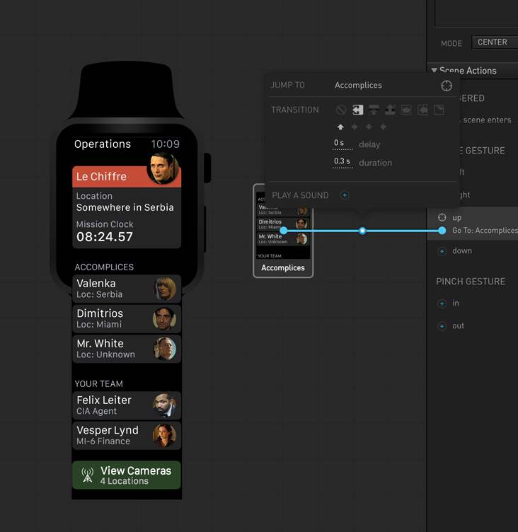
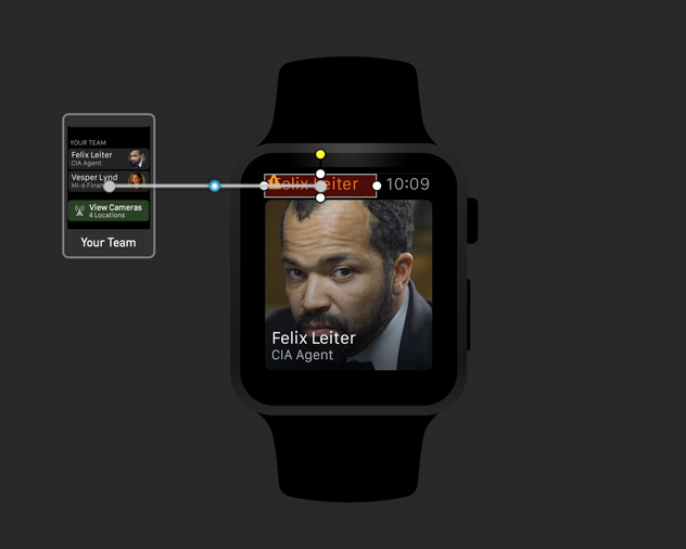
We finish off the app by creating a hotspot over our favorite agent from “across the pond” and linking our fourth scene Felix Detail with another goto action and a push transition to the right. Don’t forget to link the back button in the header with another hotspot in the status bar linking back to the Your Team scene.
Putting it together produces a nice scrolling table of information that would be the envy of any secret agent.
Hints, Tips and Tricks
The final brief comes together nicely, with three timelines corresponding to the three major components of the Apple Watch experience. Using Briefs, you can add the necessary context around your mockups so you understand where your app fits within the Watch. Below are a few tips and tricks to help you with your Apple Watch designing:
-
Use timelines to break up your design. As we did with our sample brief, use different timelines to show different parts of your design. You can create multiple different glances and notifications — these can get complicated.
-
Scene gestures are your friend. The
as scene entersgesture is a great way to simulate network delays by doing agotoaction with a delay (see the Lock Screen scene in the Notification timeline for an example). In our Glances and App timeline we made heavy use of theswipe up/downgestures. Combined with animations andgotoactions they can simulate most of the interaction you’re looking for. -
Break your individual screens into many scenes. Too many people equate a single scene to a single screen. As shown in the App timeline this can be used to effectively simulate scrolling, but it also helps break out features into logical chunks. This way developers can see breakdowns of long screens into workable chunks instead of dealing with every action on one screen. It’s not just a visual trick, it’s also an organizational trick for when the brief becomes a spec.
-
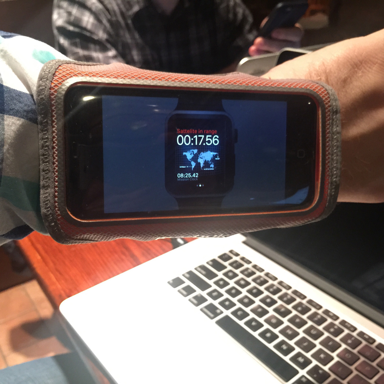
The iPhone running cuff. You probably have one around the house if you or your significant other likes to run with their iPhone. As you can see below, they can also be made to fit on your wrist and allow you to approximate using the brief while it’s on your wrist. It’s a new fashion trend!
We hope you enjoy using the beta and we hope you’ll send us feedback with any bugs, suggestions, or feature requests you have related to the Apple Watch. As you can see, we’ve had a lot of fun building this into Briefs and we believe it will change how you design for the Watch. Good luck.