3D Touch gives you access to a more powerful interface in a way that will help you move faster and naturally through your favorite apps. 3D Touch is the grown-up version of Force Touch (I hope they just rename it 3D Touch because Force Touch always sounds inappropriate).
What’s the difference between Force Touch and 3D Touch?
At first I thought Force Touch targeted the whole screen, i.e.: you can Force Touch anywhere on the screen to pull up contextual UI (like on the Apple Watch).
On the other hand, 3D Touch allows you to specify any area of the screen to trigger an additional UI layer. Force Touch has no spacial context, while 3D Touch does. It made sense in theory until I remembered the laptops with Force Touch-capable Trackpads…so really I’m not sure but if you weren’t excited about Force Touch before, 3D Touch aims to change that.
Force Touch brought a new way to interact with a screen through Multi Touch, but its full UI potential was limited by the Apple Watch, leaving many people disappointed. Force Touch on the Apple Watch was not intuitive. It broke one of the cardinal rules in UI design for me—*don’t hide important controls*. It’s a very small screen, and limitations require sacrifices. There just isn’t enough room for everything that even the most simple app needs to do. It didn’t lead to the best UI experience, but it did spawn 3D Touch.

3D Touch also grew from constraints. Since it only works on the iPhone 6s and 6s Plus, Apple had to implement the feature in a way that adds value for those with the new devices, while not denying important actions from everyone else. This result is shortcuts—a new layer on top of an existing UI. 3D Touch is focused, quick, and intuitive. It’s implemented in three parts: “Quick Actions”, “Peeks” and “Pops”.
So far, Quick Actions seem to be actions performed on the home screen, but I hope we’ll see this evolve beyond that. Peeks and Pops are more intuitive ways to app switch and preview content in table cells. Together they create a simple, focused UI layer that sits on top of the primary UI.
Quick Actions
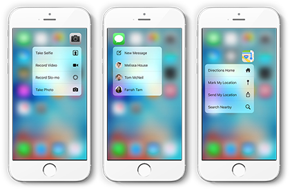
Press firmly on an app’s icon for common shortcuts. Think of it like right-click on a computer mouse, but more focused to a specific app’s utility. These are called quick actions. You can compose messages or make a phone call without ever opening the app. And yes, there’s even a quick action to take a selfie. If you’re not a Siri user, this seems to be the fastest and most intuitive way to perform tasks like this from the home screen. I hope a lot of this thinking makes its way over to the Mac.
This is an easy win for your app. Decide if shortcuts make sense for your app. If they do, the biggest challenge will be editing your list down to four actions.
Peeks and Pops
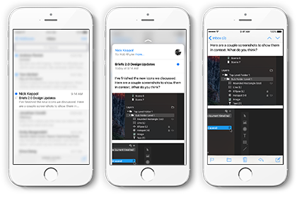
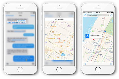
“Peek” and “Pop” can give you deeper access into an app’s content without switching views. I think the concept is best demonstrated in Mail. You can press lightly on a table cell and “peek” at a preview of the message’s contents. Press more firmly, and the view “pops” into full screen. This gesture can also be used to peek at another app’s content, like a map from an address shared via Messages—or from a weblink where you can get a peek at a preview.
Of course you get the standard continuity features for “< back to previous app” in the status bar from any popped view, allowing fast, intuitive app switching. You can stay in the app you’re working in with a peek, or pop over to another when you need to dig deeper—and then back again, all very seamlessly.
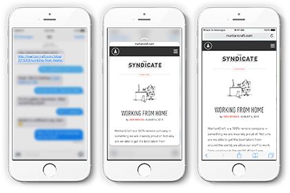
3D Touch on iOS 9 is well thought out and makes sense. For me, it takes this hardware feature from being a bit of a frustrating gimmick to something that has a great potential to provide a richer experience with well designed software. If Apple sticks with this shortcut layered approach I think 3D Touch with likely become one of those invisible features you’ll wonder how you ever lived without.
The only down side it’s not available for the iPad Pro.
You can see a demo of 3D touch in action on Apple’s website
