My name is AJ Picard, and I’m an app designer here at MartianCraft. Even though I love designing and pushing pixels every day, one thing I’m trying to get better at is coding … with SwiftUI in particular.
SwiftUI is a coding framework Apple launched a couple of years ago. I’m not a developer by any means, but I have found that it is easy to design and create animations using SwiftUI. In this tutorial, we’re going to create a floating menu button that animates when tapped.
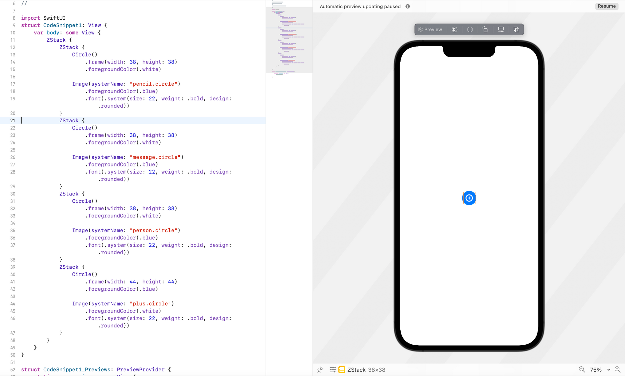
Let’s start by showing what the end result looks like for the components we’re building in this tutorial:
Thinking through the problem of creating this, we can come up with the following goals:
- Add an element for each component, including: a. The plus button used to toggle the menu’s display b. The three buttons that appear/disappear
- Layer (or stack) these elements so that the three appearing/disappearing buttons hide behind the plus button.
- When the plus button is tapped, animate the display/removal of the three underlying buttons.
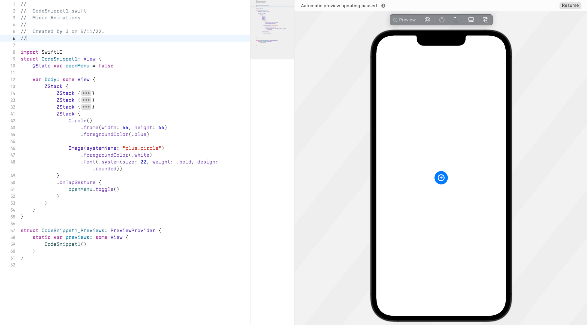
The first bit of code accomplishes goals 1 and 2:
struct ContentView: View {
	var body: some View {
		ZStack {
			ZStack {
				Circle()
					.frame(width: 38, height: 38)
					.foregroundColor(.white)

				Image(systemName: "pencil.circle")
					.foregroundColor(.blue)
					.font(.system(size: 22, weight: .bold, design: .rounded))
			}
			ZStack {
				Circle()
					.frame(width: 38, height: 38)
					.foregroundColor(.white)

				Image(systemName: "message.circle")
					.foregroundColor(.blue)
					.font(.system(size: 22, weight: .bold, design: .rounded))
			}
			ZStack {
				Circle()
					.frame(width: 38, height: 38)
					.foregroundColor(.white)

				Image(systemName: "person.circle")
					.foregroundColor(.blue)
					.font(.system(size: 22, weight: .bold, design: .rounded))
			}
			ZStack {
				Circle()
					.frame(width: 44, height: 44)
					.foregroundColor(.blue)

				Image(systemName: "plus.circle")
					.foregroundColor(.white)
					.font(.system(size: 22, weight: .bold, design: .rounded))
			}

		}
	}
}
We’re starting with a ZStack with four nested ZStacks. Each child ZStack contains a circle and an SF Symbol icon. The SF Symbol icon library from Apple is not essential for app development, but if you’d like to browse the catalog you can download the app here.
In the preview, you should only see one blue circle with a plus icon. Why can’t you see all four icons? ZStacks stack elements on top of each other, so the children of the parent ZStack are one on top of another. Because the plus icon is last in the list, it was added last and is visible on top.
To accomplish the third goal, we need to add an onTapGesture to the plus icon to animate the display and removal of the content underneath it.
Add a boolean @State variable named isMenuOpen and an onTapGesture modifier to the ZStack that contains plus.circle. This variable will control the animation when the plus icon is tapped.
struct ContentView: View {
	@State var isMenuOpen = false
	var body: some View {
		ZStack {
			ZStack {
				Circle()
					.frame(width: 38, height: 38)
					.foregroundColor(.white)

				Image(systemName: "pencil.circle")
					.foregroundColor(.blue)
					.font(.system(size: 22, weight: .bold, design: .rounded))
			}
			ZStack {
				Circle()
					.frame(width: 38, height: 38)
					.foregroundColor(.white)

				Image(systemName: "message.circle")
					.foregroundColor(.blue)
					.font(.system(size: 22, weight: .bold, design: .rounded))
			}
			ZStack {
				Circle()
					.frame(width: 38, height: 38)
					.foregroundColor(.white)

				Image(systemName: "person.circle")
					.foregroundColor(.blue)
					.font(.system(size: 22, weight: .bold, design: .rounded))
			}
			ZStack {
				Circle()
					.frame(width: 44, height: 44)
					.foregroundColor(.blue)

				Image(systemName: "plus.circle")
					.foregroundColor(.white)
					.font(.system(size: 22, weight: .bold, design: .rounded))
			}
			.onTapGesture {
				isMenuOpen.toggle()
			}
		}
	}
}
Here, we’ve added our isMenuOpen state variable at the top of the file, and we set the value equal to false.
Along with adding the state to the file, we added an onTapGesture to the ZStack that contains the plus icon, and we added isMenuOpen.toggle to the onTapGesture so that when the plus icon is tapped our isMenuOpen state will toggle from false to true.
The last step is to tell the elements stacked under the plus icon to do something when isMenuOpen is set to true.
struct ContentView: View {

	@State var isMenuOpen = false

	var body: some View {
		ZStack {

			ZStack {
				Circle()
					.frame(width: 38, height: 38)
					.foregroundColor(.white)

				Image(systemName: "pencil.circle")
					.foregroundColor(.blue)
					.font(.system(size: 22, weight: .bold, design: .rounded))
			}
			.shadow(color: .black.opacity(isMenuOpen ? 0.1 : 0.0), radius: 10, x: 0, y: 5)
			.offset(y: isMenuOpen ? -150 : 0)
			.opacity(isMenuOpen ? 100 : 0)
			.animation(.spring(response: 0.5, dampingFraction: 0.5, blendDuration: 0.5), value: isMenuOpen)

			ZStack {
				Circle()
					.frame(width: 38, height: 38)
					.foregroundColor(.white)

				Image(systemName: "message.circle")
					.foregroundColor(.blue)
					.font(.system(size: 22, weight: .bold, design: .rounded))
			}
			.shadow(color: .black.opacity(isMenuOpen ? 0.1 : 0.0), radius: 10, x: 0, y: 5)
			.offset(y: isMenuOpen ? -100 : 0)
			.opacity(isMenuOpen ? 100 : 0)
			.animation(.spring(response: 0.5, dampingFraction: 0.5, blendDuration: 0.5), value: isMenuOpen)

			ZStack {
				Circle()
					.frame(width: 38, height: 38)
					.foregroundColor(.white)

				Image(systemName: "person.circle")
					.foregroundColor(.blue)
					.font(.system(size: 22, weight: .bold, design: .rounded))

			}
			.shadow(color: .black.opacity(isMenuOpen ? 0.1 : 0.0), radius: 10, x: 0, y: 5)
			.offset(y: isMenuOpen ? -50 : 0)
			.opacity(isMenuOpen ? 100 : 0)
			.animation(.spring(response: 0.5, dampingFraction: 0.5, blendDuration: 0.5), value: isMenuOpen)

			ZStack {
				Circle()
					.frame(width: 44, height: 44)
					.foregroundColor(.blue)


				Image(systemName: isMenuOpen ? "x.circle" : "plus.circle")
					.foregroundColor(.white)
					.font(.system(size: 22, weight: .bold, design: .rounded))
					.animation(.easeInOut(duration: 0.3), value: isMenuOpen)
			}

			.onTapGesture {
				isMenuOpen.toggle()
			}
		}

	}
}
Now, there’s a lot going on in this step, so let’s break down what we’ve added. What’s great about SwiftUI is that it makes it very easy to animate things.
In the code above you see a lot of lines that look like this: isMenuOpen ? (value) : (value). The ? means “when isMenuOpen is set to true, do this,” and the : means “when isMenuOpen is set to false, do this.” This is known as the ternary operator.
Using that ternary operator, we’ve added multiple conditions for .shadow, .offset, and .opacity to each ZStack under the one holding the plus icon. This allows us to create the animation we want when we tap the plus icon: The .offset condition moves the element, the .opacity condition changes its opacity from 0 to 100, and the .shadow condition adds a box shadow to the element.
Finally, we have to add .animation to everything we’re animating so that the transition is smooth. You can play with the animation values to create different types of animation.
The end result should look like the preview video above.
You may have noticed that a lot of lines in this code look quite similar. To wrap this animation up into a more readable and maintainable bit of code, you can create a custom ViewModifier, as shown in the final implementation below:
struct ContentView: View {

	@State var isMenuOpen = false

	var body: some View {
		ZStack {

			ZStack {
				Circle()
					.frame(width: 38, height: 38)
					.foregroundColor(.white)

				Image(systemName: "pencil.circle")
					.foregroundColor(.blue)
					.font(.system(size: 22, weight: .bold, design: .rounded))
			}
			.displayOnMenuOpen(isMenuOpen, offset: -150)

			ZStack {
				Circle()
					.frame(width: 38, height: 38)
					.foregroundColor(.white)

				Image(systemName: "message.circle")
					.foregroundColor(.blue)
					.font(.system(size: 22, weight: .bold, design: .rounded))
			}
			.displayOnMenuOpen(isMenuOpen, offset: -100)

			ZStack {
				Circle()
					.frame(width: 38, height: 38)
					.foregroundColor(.white)

				Image(systemName: "person.circle")
					.foregroundColor(.blue)
					.font(.system(size: 22, weight: .bold, design: .rounded))

			}
			.displayOnMenuOpen(isMenuOpen, offset: -50)

			ZStack {
				Circle()
					.frame(width: 44, height: 44)
					.foregroundColor(.blue)

				Image(systemName: isMenuOpen ? "x.circle" : "plus.circle")
					.foregroundColor(.white)
					.font(.system(size: 22, weight: .bold, design: .rounded))
					.animation(.easeInOut(duration: 0.3), value: isMenuOpen)
			}
			.onTapGesture {
				isMenuOpen.toggle()
			}
		}
	}
}

struct DisplayOnOpenMenuViewModifier: ViewModifier {

	let isOpened: Bool
	let offset: CGFloat

	func body(content: Content) -> some View {
		content
			.shadow(color: .black.opacity(isOpened ? 0.1 : 0.0), radius: 10, x: 0, y: 5)
			.offset(y: isOpened ? offset : 0)
			.opacity(isOpened ? 100 : 0)
			.animation(.spring(response: 0.5, dampingFraction: 0.5, blendDuration: 0.5), value: isOpened)
	}
}

extension View {
	func displayOnMenuOpen(_ isOpened: Bool, offset: CGFloat) -> some View {
		modifier(DisplayOnOpenMenuViewModifier(isOpened: isOpened, offset: offset))
	}
}
SwiftUI makes it so easy to create beautiful animations and designs, and I believe it is the future of iOS development. In the next article, we will continue to build on what we created here, so stay tuned!