If you are not familiar with the terms used to discuss typography , or want to learn more about legibility and screen rendering make sure to read Part 1 first.


SF UI & SF Compact
With the Apple Watch came an entirely new, Apple designed typeface called San Francisco. It was designed to work at small sizes maximizing legibility on the new, much smaller screen of the Apple Watch. It seemed to work well in screen shots but most people wouldn’t see it in person for another seven months. People quickly installed San Francisco (SF Compact) on the Mac only to find the results were less than ideal. The spacing wasn’t right and it was hard to read long text strings. It was designed for the watch after all.
We didn’t have to wait long for a proper version of San Francisco on the Mac. In June 2015 Apple added to its type system with the introduction of San Francisco (SF UI) on OS X 10.11 and iOS 9. Just three months later in September, Apple announced the Apple TV which also uses SF UI.
So is San Francisco really the perfect system font for Apple’s products? It’s complicated.
Many critics have compared it to Helvetica and DIN. When viewed under this simplified stylistic lens, they aren’t exactly wrong. There are a lot of similarities. If we put San Francisco under the microscope, we’ll see that the visual similarities are just a small piece of this type system. It’s a typeface designed for the digital age and it excels in this medium in ways that Helvetica, DIN, or Lucida Grande never could.
The system is technically complex, but when used “correctly” it seems obvious and simple; almost transparent to the reader. That’s what makes a good type system.

San Francisco has two distinct typefaces: SF UI and SF Compact. These sibling families were designed to be “related, but not equal”. They share similar characteristics and features but are designed to look best on their intended platforms. SF UI is used on iOS, OS X, and now tvOS—SF Compact is used on the watch.

The new family includes 42 fonts consisting of two sibling families (SF UI & SF Compact), each with two optical sizes (Text & Display). Each Text size has six weights (Light, Regular, Medium, Semibold, Bold, and Heavy) with complementary italics. Each Display size has nine weights (Ultralight, Thin, Light, Regular, Medium, Semibold, Bold, Black, and Heavy). OpenType features include stylistic alternates, numerator and denominators, fractions, discretionary ligatures, lining figures, and tabular figures. It has support for latin text, cyrillic, and greek text.

SF Compact Display Regular

SF UI Display Regular
At first glance the two sibling families look pretty similar. That’s a good thing if you want to maintain a consistent typographic feel through out the system. The biggest difference can be seen in the round areas of the glyphs. SF Compact is a more geometric and compressed typeface—less round. The vertical strokes on the curves are straightened out and the characters slightly condensed.
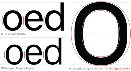
You can fit more letters on a line of text with a narrow face, which means at small sizes, you can use more spacing for text occupying the same horizontal space, which helps legibility—or cram more characters onto a single line if space is limited and you’re willing to sacrifice some legibility.

You can have more spacing between letters with SF Compact in the same space as you can with SF making it slightly easier to read at small sizes without sacrificing character/word count per line
There is a downside to compressed faces like SF Compact. It puts more strain on the eye to read long passages of text with narrow characters.
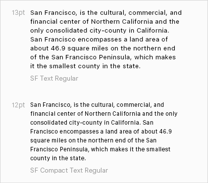
You can use more letter spacing with SF Compact and have paragraphs that occupy the same space due to it’s narrow letterforms.
We read longer strings of text more often on iOS and OS X than we do on the Apple Watch. Using a more body copy-friendly letterform like SF UI on these platforms makes sense. It also has similar characteristics to Helvetica, so it feels familiar, but different, and slightly better. It is Apple after all.
Unfortunately San Francisco has some of the same failings as Helvetica and Lucida Grande in mixed case settings. For example, it’s difficult to distinguish between the lowercase L and the capital i. To Apple’s credit though, they did take this into consideration with the vertical metrics. The ascender sits above the cap-height helping with mixed cased forms…just a little.

DIN really shines here. The finial at the end of the lowercase l adds a style and personality to the typeface. Love it or hate it for this reason—it’s the most easily distinguished and therefor legible l in these examples. Admittedly, this is an edge case, and when viewed in the context of other letters in body copy, in most cases it’s not really a problem.
San Francisco was designed for digital platforms where it’s likely to be used in random number and letter strings, say for charts, confirmation numbers, labeling, and even code. Maybe I’m making a big deal about this for nothing — I am dyslexic so I’m extra sensitive to things like this — but Apple has over 500 million users; it’s a safe bet I’m not the only one.

San Francisco’s alphabet sacrifices legibility in a few areas for a cleaner more universal look. It does however make up for it in other ways with the help of some smart features built into the typeface, and the operating systems.
Size Specific Features: Optical Sizing
One of the type designers for the San Francisco font, Antonio Cavedoni, called optical sizing “The big idea in the San Francisco family of typefaces.” If you’re not a type nerd, you may not be familiar with the term optical sizes.
In the days of metal type, subtle adjustments were made to the glyphs at each font size to ensure style and legibility of the typeface was retained through out the various sizes. It was common to add detail, adjusted stroke weights, and reduce spacing as the letters got larger. As the letters got smaller, spacing was increased, detail was simplified, and often, ink traps were added to maximize legibility once printed small.
In the digital age, we can make type any size we want with the click of a mouse, but this does not take into consideration how a font will look at that size. The outlines remain the same. Type designers solve for this by creating optical size cuts (multiple versions of a typeface to be used at different sizes). A typeface can have 2 or more optical sizes. Currently San Francisco has two optical sizes, Text and Display.

The operating systems automatically switch between these two cuts at 20pt (@ 144dpi) if your app uses the system font. Since this feature is part of Apple’s TextKit, design applications like Photoshop and Sketch will not make this switch automatically. Designers will need to switch between Text and Display cuts manually.
When you examine the two cuts, at first glance it looks like only the letter spacing has been increased on the Text cut to make it more legible at smaller sizes.

The text cut has more open spacing to aid legibility at small sizes
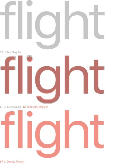
It’s much more than that though. These optical cuts have unique adjustments made to the outlines of each glyph so they look best at their intended sizes. When the spacing differences between text and display are ignored and characters are overlaid directly on top of each other, you can see the differences in the glyph shapes.

As you saw in Part 1 of this article open apertures help with legibility. SF UI has open apertures, larger overshoots on the curved glyphs, and longer descenders. The nose of the r is longer, and the crossbars on the lowercase f and t are wider in the text face. The dot on the lowercase i sits above the cap-height so it doesn’t blur with the stem of the i. These minor details all optimize the text face for use at small sizes.
San Francisco has “ink traps” on both the text and display cuts. Traditionally, ink traps subtract from the letters as seen with Bell Centennial. This was done because newsprint paper absorbs the ink and starts to bleed in the tight areas. The ink traps give extra space to allow the ink to fill in the rest of the letter.

Bell Centennial designed by Mathew Carter in 1976 for AT&T telephone directories to solve for the technical challenges inherent to printing technologies of the time
San Francisco’s notches have “extra ink” to avid a sharp corner that will become too dull when rendered on screen effecting the overall tone of the letter. These notches are more pronounced on the text cuts.

SF UI Text Regular
Type design has responded to technology since the beginning—from hand-cut wood and metal type precisely crafted for each size, to newsprint settings utilizing fonts with built in ink traps, to digital screen fonts designed for high resolution displays; and everything in between. In most cases type design is catching up to technology, but the evolution of technology will not change what makes text sizes easily legible.
Weights
A good type system has many different weights giving you control of hierarchy, mood & tone, style, and yes, legibility. San Francisco offers plenty of options. Each sibling family has nine Display weights, and six Text weights with Italics giving all the flexibility you need to create beautiful, legible typography.
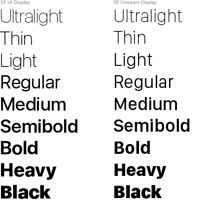
The text cut has fewer weights since the extreme weights (Ultralight, Thin, and Black) would become illegible at their intended sizes. I’d even recommend avoiding using the Heavy weight in the text sizes unless you really have to. It really pushes the limits of legibility at all but the largest recommended sizes (close to 20pt).

Both SF UI and SF Compact offer the same range of weights.
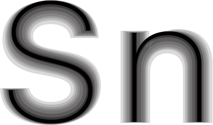
SF UI Display weight

SF UI Display weights
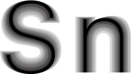
SF Compact Display weights

SFCompact Display weights
Size Specific Features: Tracking
As we’ve seen, generally, you need more letter spacing for small text than you do for display sizes. With San Francisco on Apple’s operating systems, tracking is size specific. That means each font size is intended to used with a specific tracking value. Lucky for engineers, if you use San Francisco the operating system automatically applies the tracking values based on text size.
The example below shows 100pt text and 18pt text, each with their recommended tracking values. Although both sizes have different letter spacing, they appear to have the same optical spacing. The grey tones of the two sizes are consistent making the text more comfortable to read.
(Don’t get confused by the specific tracking values shown below. I’m switching between text and display cut here and each has its own unique tracking table. There is no relationship between the tracking values of the Text and Display cuts. It’s relative to each optical size. Just remember, Text has more open tracking, Display has tighter tracking)

Top: 100pt SF Display with 7 tracking - Bottom: 18pt SF UI Text with 19 tracking
With the two optical size cuts set at the same point size, we can see how much more open the tracking is for the text size:

Text vs Display: 100pt SF Display with 0 tracking - 100pt SF UI Text with 0 tracking
Again, the system handles this automatically based on the tracking tables provided by Apple. You just have to pick the size of the text. If you need to make adjustments to the letter spacing for stylistic or layout reasons you can do so, just make sure to keep track of the system you are now building so you can hand the new metrics over to an engineer.
If we look at this spacing concept on a graph, it looks something like this:
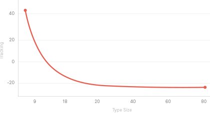
Graph shown for SF UI Text. The text cut would never be used above 20pt. This is just demonstrating the concept.
If you are designing your apps in something like Photoshop, or Sketch you’ll need to adjust the tracking at every point size if you want a realistic view of what San Francisco will look like once built. Apple has provided us with tracking tables for both SF and SF Compact. Since the side bars of a glyph are adjusted for each weight by the type designer, the same tracking values are used regardless of the font’s weight.
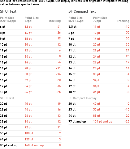
The styles look like this:

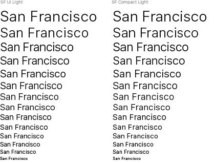
It seems pretty straight forward except for one thing. Apple says switch between text and display cuts at 20 points @2x(144ppi). This is slightly confusing for those of us used to designing at 72dpi in our design software.
When I’m designing with a 17pt font in a 1x composition (in Photoshop) @72dpi, when I increase the canvas size by 2x, the 17pt text becomes 34pt @2x. (The tracking values remain the same since those values are based on an Em, a relative unit. A tracking adjustment made at one point size will have the same effect at another point size.) Apple’s chart shows @2x sizes as half the 1x size, rather than doubled as it would be in Photoshop. This has to do with dpi scaling and I won’t go too far into it, but just know:
- If you design at 1x at 72dpi switch to display at 40pt
- If you are designing at 2x @72 dpi switch to display at 20pt
- If you are designing at 144dpi switch to display at 20pt.
Special Features: Numerals
Both SF and SF Compact include proportional lining, and tabular numerals. By default San Francisco uses proportional lining figures.

Proportional Lining Figures

If you’re setting data inline, or as static numerals, use the default proportional numbers. This will give the correct grey space and rhythm to the numbers. If you were to use tabular figures here, the spacing would be jumbled and look like a poorly-kerned font.
If you’re animating a numeric sequence, or setting data in a table for comparison, you should use tabular figures. In Photoshop and Illustrator. you can access these characters through the glyphs palette

Tabular Figures

San Francisco has a handful of glyphs for common fractions as well (1/2, 1/4, etc). If you need something that’s not built in, it offers a full set of numerators and denominators; and a proper fraction bar (Don’t use the forward slash for this…ever) to build your own unique fractions.

Below is an example of the same fraction set in three different ways. The first just changes the size of a single weight font. Notice how light the fraction feels here compared to the 12. The second example adjusts the weight of the fraction to closer match the 12, but it’s not perfect. The third example is set with a single font using the numerators and denominators.

San Francisco also has alternate glyphs for several of the numbers.
I’m sure it’s happened to you with certain fonts. Letters and numbers with similar forms get misread. For example, it’s easy to confuse a capital B and an 8. A capital A and a 4; or a capital G and a 6. This is partly why non-lining old-style numerals exist. To solve for this legibility challenge, and add a bit more style to the typeface, San Francisco has alternates for the 4, 6, and 9 for both proportional and tabular figures.
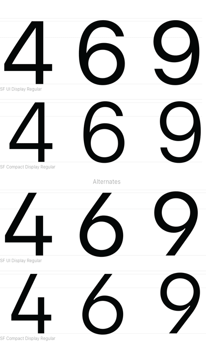
If you have seen an Apple Watch, you may have noticed them in use already.
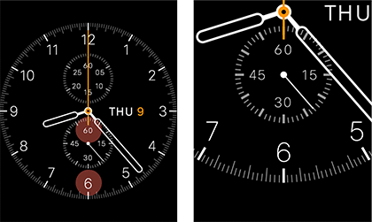
Photoshop render of the Chronograph face @2x on the left, and @4x on the right.
There’s also a pretty smart feature built in using contextual alternates.
Normally, punctuation sits on the baseline., however this looks off balance in time formats. Before San Francisco, you needed a few lines of code to fix this. More importantly, you had to remember to do it. San Francisco solves for this by having an alternate glyph with the colon aligned to the cap-heights optical center. The system switches to it automatically when it recognizes a time format. You can achieve the same thing in Photoshop by turning on the contextual alternates button in the Character palette, or by selecting the character from the Glyphs palette.

Now that we’ve taken a look at San Francisco, let’s talk a little about the API that makes a lot of these features possible, Text Kit.
With the release of iOS 7 in 2013, Apple shifted their aesthetic direction from glossy buttons and skeuomorphic designs with medium and bold weights of Helvetica, to a cleaner, flatter, more typography focused design language filled with lighter text weights of Helvetica Neue. iOS 7 brought the content front and center, it also brought Helvetica Neue to everyones attention. This new design language relies heavily on good typography. There was a lot of criticism from designers for their choice of light weights of an already illegible typeface for screen design. Apple needed a new typeface, but looking back, the big news was TextKit.
Text APIs
TextKit, an API (Application Programming Interface), is a fast and modern text layout and rendering engine making use of advanced unicode features, kerning and ligature support, dynamic sizing, and advanced layout techniques. TextKit has support for Dynamic type, Font descriptors, and Symbolic traits.
Dynamic Type introduced the concept of managed type styles—pre defined sizes, weights, and spacing values (set by Apple?) optimized for legibility, making text easier to read. Keeping accessibility in mind, Dynamic Type also gives the user the ability to globally adjust these type styles across the OS (with options for small, medium, large, and bold styles). (iOS only?)
Font Descriptors made it easier for developers to build, archive, and reference unique type styles and manage them through out their application.
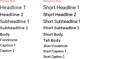
Symbolic traits allow you to create alternate styles based on your primary styles. In this example, the primary style has two Symbolic traits, or alternate styles. A Bold style, and an Italic style.
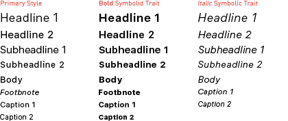
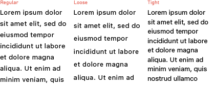
You may then want to have even more alternate styles, maybe to adjust the line spacing on a specific Font Descriptor inside a style. For example, we can add styles for Loose and Tight line spacing for the primary Body style.
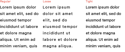
Then add more styles to adjust the tracking of the Caption style.
With TextKit we can build out a type system that is easy to manage with a level of control over the typography designers have been asking for—all within a dynamic and accessible environment.
TextKit gives designers and developers full control over the typography in their interfaces. It brings accessibility features to your apps, and give you access to all of the advanced features of typefaces like San Francisco. While these APIs did help make Helvetica more legible it couldn’t overcome the challenges inherent to the letterforms of Helvetica.
All in on Retina
San Francisco is a nice-looking font. It has the same invisible feel that Helvetica has with touches of DIN to aid in legibility and add a bit of style. I’m really excited to see Apple embracing optical size but I can’t help but think they could have pushed this even further (time permitting).
I’m writing this right now on a late 2012 iMac — non-Retina. SF UI is sharper than Helvetica Neue, but on non-Retina displays it’s not that much better in terms of legibility. SF UI still has blurry apertures and counters when set at most of the commonly used sizes. The grey tones are still spotty across long passages of text. It’s an over simplification, but it still looks like Helvetica with most of its shortcomings on 1x displays.
On Retina displays it’s a whole different story. SF UI feels more airy than Helvetica. The apertures render with clear definition and feel comfortably open. The letter are easily distinguished in a long string. It performs pretty well, even without my glasses on, especially in the text sizes. The spacing is a little tight in some areas, but not by much. I love SF UI on retina Macs and iOS devices—I deal with it on my iMac.
I could just upgrade my iMac, and I probably will now, but not everyone has that luxury or needs it for work. There are still plenty of people using non-Retina Macs. Oh, and then there’s the new 1080p Apple TV which also uses San Francisco. I haven’t seen one in person yet, maybe they made some additional changes to the typeface for the TV, but if they didn’t expect to still be squinting at your TV as you try and scan through titles. The switch to black text on a light background on the new tvOS UI will help but I’d still expect to see it perform very similar to SF on non retina, which is less than ideal. I’d bet SF UI will look great when we have a 4K Apple TV — but we’re not there yet.
It may be a lot to ask for since traditionally Apple designs for the latest and greatest technology, but I think we need an optical cut of SF UI for non-Retina Macs.
That was my “big idea” going into this article after looking at the developer preview in June on my non-Retina iMac, but after the only 1080p Apple TV announcement this month, I think this becomes even more important. Apple embraced optical sizes which tells me they really do care about legibility — they just ignored non-Retina.
These things take time though and I doubt the type design team at Apple is very large. I’m not proposing a font designed for ultra low resolution like Verdana or Input — rather something more subtle and on brand. If Apple were to exaggerate the changes they made to the text sized glyphs vs the display cuts—opening the apertures and counters a bit more; and adjusted the spacing metrics…and maybe the weights, I think we could have a really nice looking, legible version of SF UI for low-resolution displays without any real impact to style. Would it be obsolete in 5-7 years? Yes, probably—but if everyone using a 1x display could have a better experience until everything is retina, isn’t it worth it?
- To download SanFrancisco you need a developer account.
- You may only use San Francisco for creating mock-ups of user interfaces to be used in software products running on Apple’s operating systems. Read through the EULA included with the download.
