We got our first glimpse of Apple’s new sans-serif typeface, San Francisco, when the Apple Watch was unveiled in September of 2014—a new typeface designed specifically for legibility at small sizes on a tiny, high-resolution screen. Big news for type nerds and Apple fans alike. San Francisco was the first publicly released, Apple-designed typeface in over 20 years. Its name is familiar, harking back to the previous convention of naming typefaces after “world class cities” like Chicago, Geneva, Athens. London, Venice, and yes, San Francisco.

SF Compact Display Regular

SF UI Display Regular
It looks familiar. It’s been compared to Android’s Roboto, the ubiquitous Swiss sans-serif typeface Helvetica, and one of my favorite typefaces DIN, designed for highways signs in Germany. It’s hard to talk about San Francisco without touching on these popular sans-serif typefaces—the failings of Helvetica as a text face, and the success of Lucida Grande as a UI font.
San Francisco was originally only available on the Apple Watch.
This year, at WWDC15, Apple announced San Francisco is coming to the Mac and iOS, completing its vision for typographic consistency across OS X, iOS, and watchOS.
The Apple Watch typeface San Francisco hasn’t simply been moved to iOS and OS X; a new typeface called SF UI will be used there instead. San Francisco (as we knew it) has been renamed SF Compact.

Before we take a look at San Francisco, there are some typographic terms and concepts you should be familiar with. If you’re a pro, you can skip ahead a bit.
Form and Metrics
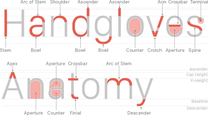

A small stroke at the end of an arm, stem, or tail of a character.

Type without serif.
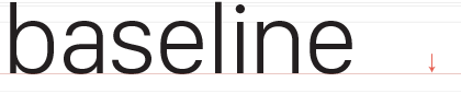
The imaginary line upon which the text rests. Glyphs with curves at the bottom extend below the baseline. Descenders extend far below the baseline.

The part of the glyph that extends above the x-height to the ascender line.

The part of the glyph that extends below the baseline to the descender line.
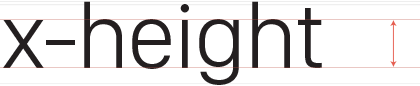
The height of the lowercase letters with no ascenders or descenders. It is usually calculated by the height of the lowercase x since it does not have overshoots like the curved forms.
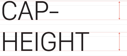
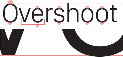
The distance from the baseline to the top of the capital letter in an alphabet. Oval letters will often overshoot the baseline and cap-height to achieve a visual balance between the glyphs.
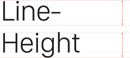
The line-height is the area defined by the ascender and descender of each glyph in a font. This is also referred to as the typographic balance, or typographic center.
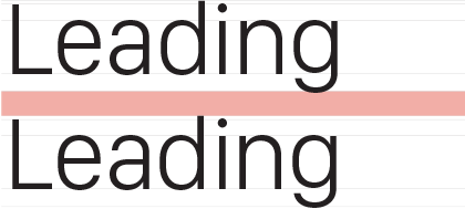
The adjustable amount of vertical space between lines of type. The term originates from the use of lead strips to add space between the lines in letterpress printing.
The part of the curve that hangs below the baseline, or sits above the x-height and cap-height on curved glyphs. This makes the circular glyphs appear like they sit on lines.
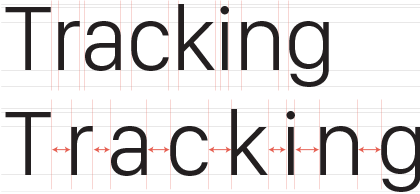
The adjustable space between groups of letters. Tracking is applied equally across a line of text.
Top: No tracking - set to 0 | Bottom: Open tracking - set to 120.
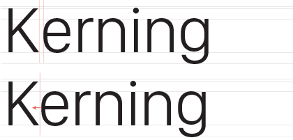
Kerning is the adjustable space between two glyphs to achieve an optically pleasing result. This should not be confused with Tracking which applies spacing equally between all of the glyphs.
Glyph Widths & Spacing
Each glyph has a defined size called the em-box. The easiest way to understand this concept is to consider a monospace font. In monospace fonts the em-box width is the same for all of the glyphs. Most typefaces are not monospace, they have proportional em-boxes with optical sidebar values so each glyph occupies the space it needs. These sidebars are part of the built-in spacing metrics for a typeface (tracking and kerning can be applied). The sidebars are shown below for SF UI Display Light.
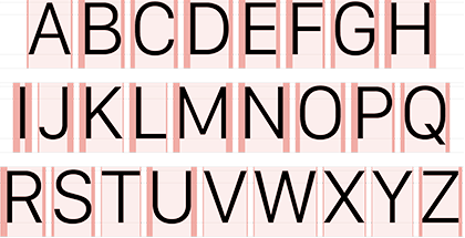
Vertical strokes like the left side of the B, D, E, F, H… etc have consistent side bars. Characters that have open sides like the A, C, F, J, L… etc have smaller side bar settings since these open areas add to the optical white space seen between characters. Kerning can later be applied by the designer to correct for certain letter combinations.
The space between the glyphs represents tracking. When tracking is set to 0, the glyphs’ em-boxes touch. This comes from the days of hand set type when a fonts side bars + the glyph width defined the width of a piece of cast metal type. To space out letters, they added metal between the characters.

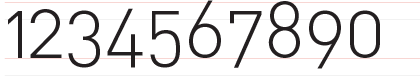
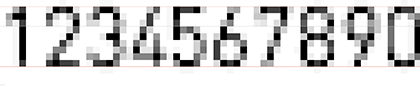
The default numerals in most typefaces are proportional lining glyphs with optically set side bars. Shown here with SF Compact Display Light.

Tabular figures are alternate, monospaced numbers included in some typefaces. The glyphs are optically centered within a consistent width em-box. They can be either old-style, or lining figures. They are meant to be used for tables of data, or any place you are comparing numbers. Shown here with SF Compact Display Light.
Legibility
There have not been many studies on what makes text legible, partly in fact because that depends on a number of variables. Serif or Sans-Serif; text or display sizes; and the context of the surrounding letters and words, etc.
There are many factors that affect legibility and readability. Some of this may be an over simplification but for the purpose of this article I’ll summarize the common methods of checking legibility of a text face. If you find this interesting I encourage you to read Fábio Duarte Martins’s post on legibility.
Typefaces with more open forms, specifically the apertures and counters, are easier to read at text sizes but can look too open at larger display sizes.
Wider more defined characters with ample spacing are easier to read in body copy—compressed typefaces are great for headlines and small spaces where information density is a priority and worth sacrificing some legibility.
The best typefaces have both beautifully elegant styling, as well as precise and comfortably legible forms while offering a wide range of flexible widths, weights, and alternates.
There are three basic typographic principals that are generally followed to achieve highly legible text sizes when using sans-serif type.
- Large x-height
- Open Apertures
- Comfortable spacing
Type designers are beginning to respond to new screen technologies. Most modern screen fonts are designed for high resolution displays. High resolution displays mean more detail for text of the same size on a “normal” display. More detail means more information the eye can use to differentiate characters. The more detail the eye has, the more legible the text becomes.
You have to pick a target. Fonts designed for low resolution screens don’t work as well on high resolution displays—on the other hand, fonts with loads of detail fall apart on low resolution screens. People with low resolution displays should not be punished with diminished legibility.
Large x-height
At body text sizes, even on a Retina display, a typeface has very little vertical pixels to use. In Latin based languages, we distinguish characters primarily with the information stored in the lowercase character’s x-height. More specifically, the top parts of the x-height & ascender. It’s common knowledge among designers to pick typefaces with larger x-heights when concerned about legibility. It makes sense in theory but I think it’s a bit of an over simplification.
In general this is true, but whats more important is that the typeface has an appropriate sized x-height at the size you are using it.
There are three ways that you can compare the x-heights across multiple typefaces—each way will yield different results.
- Same cap-height. (this may mean using different point sizes)
- Same x-height. (this may mean using different point sizes)
- Same point size. (x-heights and cap-heights likely will not align)
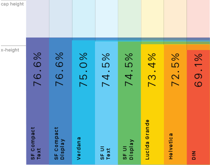
Same cap-height
The first way to compare the x-heights is to scale all of the typefaces to the same cap-height. This will give us the ratio of the x-height to the cap-height. If we use this metric for comparison, SF Compact and Verdana perform best, and DIN the worst.
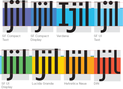
Same cap-height comparison: I chose these characters because they are narrow and I can fit them all on screen at a large size, but they also tell us a lot about the typeface. The capital i gives us the cap height. The lowercase j gives us the descender distance. The lowercase i gives us the x height, and the lowercase l gives us the ascender height.
If we use this metric to evaluate legibility, It seems obvious that a larger x-height increases legibility. This is probably true for characters like the a, e, s that need precise apertures and are likely to collapse if too small.

Same cap height comparison: 160pt Verdana Regular and 163pt DIN Regular — In this example Verdana is more legible because of the taller x-height.
But what if you’re setting type in a language that needs diacritical marks? Those usually fall between the x-height and the cap height. The closer these marks are to the x-height, the more likely it is they will blur at small sizes. If you are setting type in a language that uses diacritical marks, you would be best served by a typeface with a nice balance between the x-height and the cap-height, giving ample room for accents.

Comparing fonts at the same x-height is a common metric used in legibility studies. To me, the problem with this practice is when you compare two typefaces at the same point sizes (a more real world scenario for a designer) the results are very different. This Cap-height comparison shouldn’t be ignored though, it does tell us that we should use typefaces like DIN at a larger point size than typefaces like Verdana.
So what are the results when we compare these typefaces at the same point size?
Same point size
This is how we usually compare type—set at the same size, however this form of comparison can also be flawed.
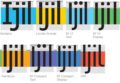
Same point size comparison: All fonts set at 160pt and aligned on their baselines.
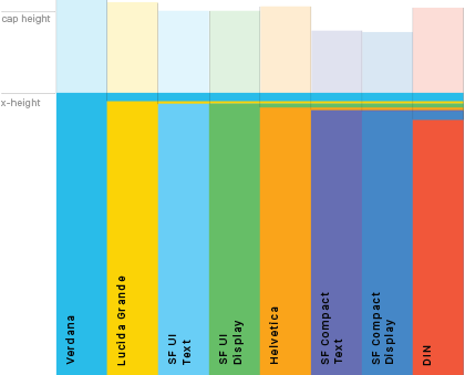
Same point size comparison: X-height comparison shown at about 834pt.
If we look at the two ends of the spectrum from above, Verdana and DIN, we can see how different the x-heights can be when comparing two typefaces at the same size.

160pt Verdana Regular — 160pt DIN Regular.
We have more stroke information being stored between the baseline and x-height of Verdana than we do with DIN due to Verdana’s larger x-height. If you look at characters with 3 horizontal strokes all within the x-height like the a, s, and e—the larger x-height allows for more open counters and apertures. This should make the typeface more legible right? If we use this metric for comparison, we can assume Verdana is more legible than DIN and SF UI is more legible than SF Compact. Is that really the case though?
Certainly not if you are say, setting type in German. Many languages use diacritical marks above the characters. German uses the umlaut; Greek the trema; or the acute in Spanish to name a few. The larger the x-height, the smaller the space becomes for these diacritical marks which will start to decrease legibility.

Even though DIN has the smallest x-height in this group, it probably would be the best choice for a language that uses diacritics. No surprise, DIN is a German typeface. Always consider your use case and be wary of any sweeping generalization.
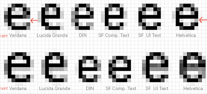
To complicate things further, at the same font size, two fonts can render very differently on screen, especially at small sizes—and those results can be inconsistent. For example, at 12pt Verdana has a x-height of 7pixels on a 1x display while 12pt DIN has an x-height of only 6 pixels. At 13pt, they are both 7 pixels. At 14pt, Verdana’s x-height is once again, 1px larger at 8px.
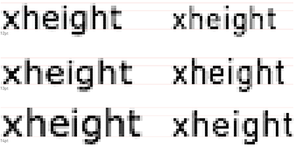
Verdana (left) and DIN (right) at 12, 13, and 14 point
DIN’s x-height is not that different from Verdana right? Why does this happen? Subtle changes have a big impact when scaled down to a small pixel grid. We’re scaling a glyph drawn at 2048pt down to 12pt. As we saw with the old-style figures and the apertures, the point’s placement on that smaller pixel grid controls how the anti-aliasing is resolved—and in this case, the vertical metrics.
This is something to pay close attention to when you are just replacing a typeface, and not adjusting your font sizes. You may want to do this if you are replacing the system font in your application with a custom font for a new release but don’t want to overhaul all of your type sizes.
If you scale two fonts to have the same x-height, any legibility differences caused by the different proportioned x-heights could disappear—in some cases the larger x-heights could even begin to work against the typeface, actually diminishing legibility.

160pt Verdana Regular and 178pt DIN Regular — In this example DIN actually seems more legible than Verdana because it has more open apertures.
Since DIN has a smaller x-height than Verdana, it inherently has a taller ascender. Because of this, it could be argued that that smaller x-heights actually aid in legibility if used at the “right size”.
When comparing characters like the lowercase n and h where the ascender is the differentiating stroke, the larger x-height of Verdana means it has a shorter ascender potentially causing problems when trying to distinguish between these two characters.

If comparing typefaces this way, DIN seems to be more legible because of it’s taller ascender.
Verdana has a pretty good balance here though so it’s not the greatest example to illustrate this point (it’s a Matthew Carter font after all). If the effect is exaggerated by increasing the x-height even further on Verdana, and decreasing it on DIN, you can easily see the potential problem when an x-height is too large and an ascender too small. In This example it could be argued that a smaller x-height actually aids legibility.

Verdana with an extended x-height and DIN with a shortened x-height. It becomes very hard to differentiate between the lowercase n and h.
This just goes to show how important it is to look at every character when selecting a typeface.
Rather than saying a taller x-height is better for legibility, I think it’s more important to say a typeface needs to have a good balance between the x-height, and the ascenders & descenders. The vertical proportions of a typeface should always be examined and considered when setting body copy. You can adjust point size to compensate for a small x-height and this can actually aid legibility.
Open Apertures
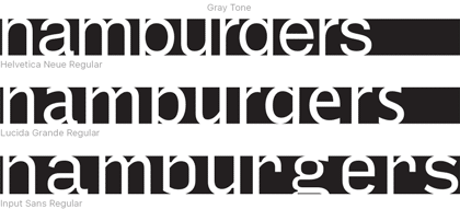
As we saw looking at the x-heights above, open apertures make text easier to read. The ‘white space’ around a letter affects legibility as significantly as the strokes do.. I don’t just mean the spacing between the letters—the apertures and counters also effect this tone.
When a glyph’s aperture is too tight it will collapse on itself becoming blurry (both literally on low resolution displays or at small sizes, and optically when quickly scanning/reading through a series of words.

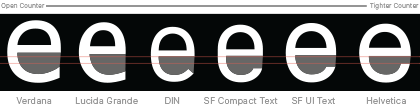
The open counters and apertures of DIN allow the eye to flow easily across it’s forms. Note the nice balance of the text weight, to the “white space” around the text.
Verdana and Lucida Grande have very open apertures avoiding becoming blurry at nearly all sizes. The bowl of the e does not curve back into the cross bar. It renders as a sharply defined aperture. These open apertures are one of primary traits of most screen fonts designed to be used at small sized or for low resolution displays. DIN sits some where in the middle between Helvetica and Lucida in terms of open apertures and the angle of the terminals.
High resolution displays are become more and more common, especially with Apple users. The argument can be made that typefaces like Lucida and Verdana are no longer necessary to achieve legible text at 11-14pt. This is partly true, and Lucida doesn’t look great on a retina display, but the characteristics that make faces like it legible on low resolution displays are still important considerations to make when designing or picking a screen font.
Helvetica Neue
Helvetica Neue has narrow apertures, with horizontally cut terminals giving strength to the forms at large sizes, but diminishing legibility at small sizes where the details begin to blur. It has a consistent tone across the entire typeface. This works fine for display sizes—it’s clean, modern, and timeless, but becomes very blurry and straining on the eyes at small sizes. It’s designed to have clean forms, and perfect grey tones not be the most legible text typeface.

Helvetica Neue Regular - Horizontal cut terminals on arcs.
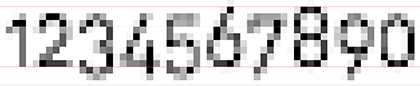
12pt Helvetica Neue Regular zoomed to 1600% - This is about what your screen renders on a non retina display. Now, image your eye zipping through a paragraph of text, or quickly scanning a UI label.
12pt Helvetica Neue Regular @2x -or- 24pt @1x zoomed to 1600%. This is what you would get on most retina displays. It’s a little better, but the consistent tone of Helvetica becomes more pronounced and the apertures still blur.
Lucida Grande
12pt Lucida Grande Regular zoomed to 1600%.
12pt Lucida Grande Regular @2x -or- 24pt @1x zoomed to 1600%.
I’m spending so much time talking about the apertures because similar optical traits can be seen in all of the negative spaces: the counters, the space around the letter, and the space between letters. In typography the space around the letters is just as important as the strokes of the letters.
When you try and achieve a perfect balance between the black and white parts of the letters, you end up with something like Helvetica. The forms inside of Helvetica are drawn beautifully. It has nearly perfect grey tones—and why it fails for body copy and at small sizes.
12pt Lucida Grande Regular @2x -or- 24pt @1x zoomed to 1600%.
Lucida inner shapes are a little more awkward, almost illegible when you just look at the negative space, but it serves a purpose, the text itself is very legible at low resolution. If you want maximum legibility you can use something like Input, a coding font drawn on a 12px grid. It has clumsy, chiseled looking forms when viewed large, but is extremely legible at small sizes on a low resolution display. It does all of this while maintaining very pleasing grey tones.
The grey tone, the space around the letters, and the space within the letters for Helvetica Neue and Lucida Grande.
It was clear when Apple changed to Helvetica on OS X they were focusing on Retina design for the Mac.
“For some, the choice of a font may not be a big deal. But to us, it’s an integral part of the interface. In OS X Yosemite, fonts have been refined systemwide to be more legible and consistent across the Mac experience. You’ll notice a fresh, new typeface in app windows, menu bars, and throughout the system. The type looks great on any Mac, and even more stunning on a Mac with a Retina display.”
APPLE on Yosemite’s use
More legible? Really?
Marketing talk, but everyone knew Helvetica was terrible on 1x displays. Yes, Retina helped. But it can’t turn a bad type selection into a good one.
Consistent Heights
A typeface is drawn at either 1000, 1024, or 2048 units. When rendered to a screen that’s usually translated to between 10 and 30 pixels (@1x) depending on the font size. Aligning similarly sized objects will give a more consistent tone to a line of text when it’s displayed on screen. The placement of all of the vector points and curves becomes very important when scaling an outline so drastically.
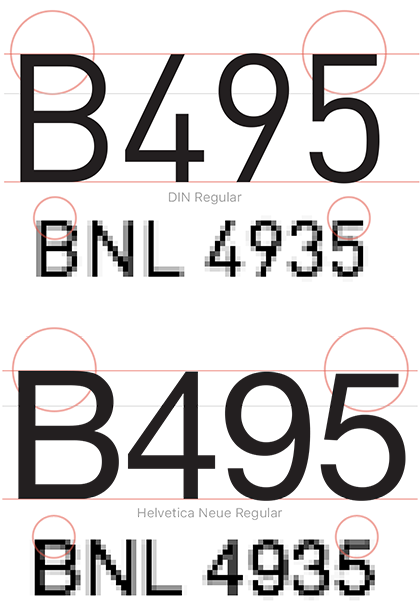
Helvetica has numbers that are slightly smaller than the cap-height. This practice dates back to the days of metal type. Most of these fonts had only one set of numerals so it was important the numbers looked good with both uppercase and lowercase letters—this meant shortening the numbers slightly so they did not look too large when paired with the lowercase letters. The effect is subtle, but if the typeface didn’t have alternate old style figures, it was the best solution at the time. Now, with digital type, a type designer can include many alternate glyphs.
DIN’s capital letters and numbers both fall perfectly on the cap-height. I haven’t been able to find a clear answer as to why but I’m guessing this was done to make production and installation of the physically cut letters easier. Later versions of DIN included old style figured to be used with lowercase text.

Helvetica Neue Light

DIN Light
DIN Light Alternate - Most sans-serif typefaces do not have old-style (also called non-lining) figures, it’s primarily seen in serif faces meant for body copy where it will often be used with lowercase text. Some typographers will argue this should be the default numeral style.
I mention old style figures to demonstrate the concept. When the glyphs shift around as much as they do in (DIN’s) old style figures, you can really see how much of an effect inconsistent heights have on the rendering at small sizes. The closer the vector points of the glyph are to the pixel grid at the given size, the sharper the glyphs will render.
DIN Light Alternate 12pt zoomed to 1600%
DIN Light 12pt zoomed to 1600%
In practice, the top cross bars on letters like the capital E, F and B have the same pixel density at the top as numbers like the 5 and 7. helping maintain a consistent grey tone across the font. If we compare DIN and Helvetica with both letters and numbers you can see what I mean.
If the concept of similar heights is taken too literally, it can cause other legibility problems. Consistent heights are important, but you also want to be careful not to make the characters too similar when designing a face used for body copy.
Like many sans-serifs, Helvetica and Lucida Grande have no visible difference between the capital i and the lower-case L making it even more of a problematic text face—especially for dyslexic readers like myself.
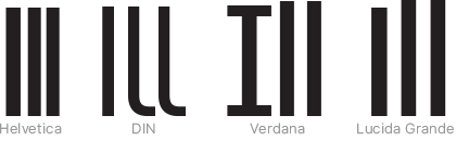
The finial on the lowercase L in DIN is a unique characteristic. It’s common in sans-serif designs for it to be difficult to tell the difference between a capital i and a lowercase L. Verdana solves for this by using a serif on the capital i. Some versions of DIN even have an alternate capital i with serifs like Verdana.
Spacing
You can’t set all of your letter-spacing to default values and expect legible text. All typefaces have built in spacing metrics. These metrics are usually set for an ideal size (range) at which the typeface is expected to be used. When using the typeface outside of these size ranges, or when trying to achieve a certain style, or pleasing texture to the text, we can fine tune the spacing by tracking and/or kerning the text.
You can tell where the ideal size range for a typeface is by researching the typeface design, or just by seeing what size the text looks best with 0 tracking.
Here are some tips to take control over the legibility of your typography by adjusting the spacing.
- Use open tracking when setting type at small and body copy sizes or when on a busy background.
- Be careful not to track out the letters too much on body copy — the words will begin to fall apart and make the text illegible. Designers will hate you.
- Use tighter tracking when setting type at display sizes.
- Use open tracking for all caps, but be careful not to over do it.
- Numbers need more space than letters
- Pay attention to the texture of the text
- Read the text
Pay attention to the spacing of your text when designing your applications. Ideal spacing values differ between every typeface, weight, and font size.
Moving away from Helvetica
People have really strong feelings about Helvetica. Helvetica is not a bad typeface, it’s a bad UI typeface. John Boardley said it well:
“…type is a tool. A hammer, even the best hammer in the whole universe, is really quite useless at removing screws. It’s not the hammer’s fault: first, it’s an inanimate object without a shred of consciousness or will; second, it is simply a tool — frequently — the wrong tool for the job. Need I add, the same can be said for typefaces. Hating the hammer?
And that’s why it’s difficult for good designers to name their favorite typeface. Favorite for what? For text? For toilet tissue branding? For books? For UI? For… — you get the point. What’s your favorite tool? Hammer? Screwdriver? Chainsaw? The choice of typeface is decided only when one knows the nature of the job. It does not precede it. And sometimes, Helvetica will be one of the tools adequate for the job.”
JOHN BOARDLEY on ilovetypography.com
Some of the most well known typefaces were designed to be used in a specific contexts. However certain characteristics of the design that makes it excel in the intended application, can make it a poor type choice for a different application. This is partly why there are so many similar typefaces. It’s common for typefaces to share similar anatomy, forms, and traits, redesigning slightly to make it work well in the intended application. It looks like this is what Apple did with San Francisco and that’s not a bad thing.
Apple’s new watch typeface is kinda similar to other typefaces. In other news, almost all typefaces are kinda similar to other typefaces.
- Nick Sherman (@NickSherman)
November20, 2014